
Your booking page is where intent becomes a confirmed reservation. Or where it quietly disappears.
Most businesses obsess over driving traffic, then lose potential customers to a clunky scheduling interface, a form that asks too much, or a date picker that barely works on mobile.
This article breaks down real booking page design examples across appointments, hotels, events, restaurants, and SaaS tools. You will see what the best pages do differently, which design patterns consistently improve booking page conversion, and what mistakes cost businesses real reservations every day.
By the end, you will have a clear picture of what a high-performing online reservation page actually looks like.
What is a Booking Page
A booking page is a dedicated page where users select a time, service, seat, or date and confirm a reservation. It is not a contact form and not a checkout page.
The distinction matters. A contact form collects messages. A checkout page processes a product sale. A booking page does something different: it resolves availability, captures user intent, and produces a confirmed reservation.
Most booking pages share four components regardless of industry:
- Availability display: calendar widget, time slot grid, or date picker
- Selection mechanism: how users choose their option
- User input fields: name, contact, special requests
- Confirmation trigger: the action that locks in the reservation
The booking page sits in its own category. It carries real stakes. A missed click or a confusing form field costs a real reservation.
Types of Booking Pages
Appointment booking pages are the most common. Think Calendly, Acuity Scheduling, or a salon's online scheduler. The user picks a service, then a time.
Event ticketing pages add seat selection or ticket tiers. Rental reservation pages handle date ranges instead of single time slots. Table booking pages manage party size, time preference, and often a special request field.
| Type | Core variable | Examples |
|---|---|---|
| Appointment | Time slot | Calendly, Acuity, Zocdoc |
| Accommodation | Date range | Airbnb, Booking.com |
| Event/Ticketing | Seat / ticket tier | Eventbrite, Ticketmaster |
| Table reservation | Party size + time | OpenTable, Resy |
Each type requires a different scheduling interface design. A date picker built for a two-night hotel stay is the wrong component for a 30-minute haircut.
What Makes a Booking Page Design Effective
81% of online travel bookings are abandoned before payment, most due to poor checkout experiences, hidden fees, or forms that ask for too much too soon (Hotelagio, 2025).
That number signals one thing: most booking page failures are design failures.
Friction, Trust, and Confirmation
The Baymard Institute's 2024 research found that 22% of shoppers abandoned checkout because the process was too long or too complicated. Another 24% left when they were forced to create an account before booking.
Three factors separate high-converting reservation page designs from weak ones:
- Low friction: minimum fields, no forced account creation, clear next steps
- Visible trust signals: security indicators, cancellation policy, review count
- Clear confirmation: what happens after the user submits
Security concerns are the top reason users abandon booking forms, cited by 29% of respondents (FormStory). Trust badges, SSL indicators, and a visible cancellation policy address this directly.
Mobile-First Layout Considerations
About 35% of all travel bookings now happen on mobile (Euromonitor, 2023). But mobile booking conversion rates sit at roughly 2.6% on travel sites versus 7.6% on desktop (ContentSquare, 2024).
That gap is a design problem.
Tap targets that are too small, date pickers that don't resize properly, and multi-column form layouts all kill mobile booking flows. Single-column forms are completed an average of 15.4 seconds faster than multi-column ones (CXL).
The booking page user flow on mobile needs to be treated as a separate design challenge, not a resized version of the desktop layout.
CTA Placement and Labeling
CTA label choice matters more than most designers give it credit for. "Book Now" performs differently from "Check Availability" in contexts where users aren't ready to commit.
Ralabs found in their booking UX work that placing the CTA above the fold, before users had to scroll, directly increased engagement with the first step of the funnel. Small placement decisions compound across a multi-step booking flow.
Create a high-converting booking page design with Trafft
Transform your booking experience and boost conversions with Trafft!
Our cutting-edge platform is designed to help you create a high-converting booking page that not only attracts visitors but also turns them into loyal customers. With Trafft, you can effortlessly design a booking page that aligns with your brand, integrates seamlessly with your existing tools, and offers an intuitive, user-friendly experience.
Why choose Trafft?
1. User-friendly design tools
Trafft offers a range of customizable templates that make it easy to create a visually appealing and functional booking page. Whether you're looking for a sleek, modern design or a more traditional layout, our platform provides the flexibility to match your brand's identity.
2. Real-time availability and scheduling
Say goodbye to scheduling conflicts and double bookings with Trafft's real-time availability features. Our system ensures that your booking page always reflects accurate, up-to-date information, providing a smooth and efficient experience for both you and your customers.
3. Seamless integrations
Integrate Trafft with your favorite tools and platforms, including payment gateways, email marketing tools, and calendars. This seamless integration streamlines your booking process, reduces administrative tasks, and keeps all your systems in sync.
4. Automated confirmations and reminders
Keep your customers informed and reduce no-shows with Trafft's automated confirmation and reminder emails. Customize these communications to fit your brand’s voice and ensure your clients are always up-to-date with their bookings.
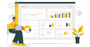
5. Data-driven insights
Gain valuable insights into your booking performance with Trafft's analytics and reporting features. Track key metrics, analyze customer behavior, and make data-driven decisions to continuously improve your booking page and overall business strategy.

Here's a video on how easy it is to set up your booking website with Trafft:
Want to know more? Check out Trafft's awesome features to see what you are missing.
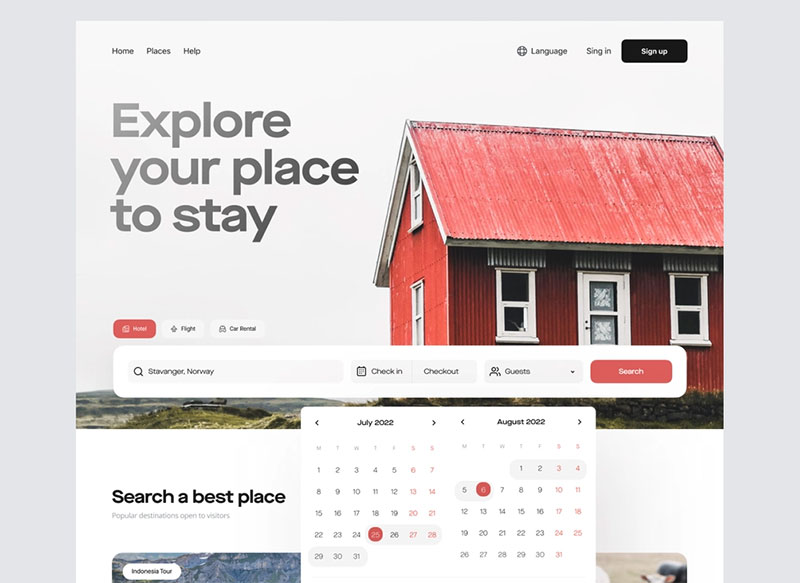
Booking Page Design Examples
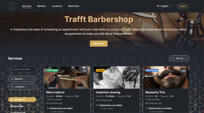
Barbershop Booking Page Design Example
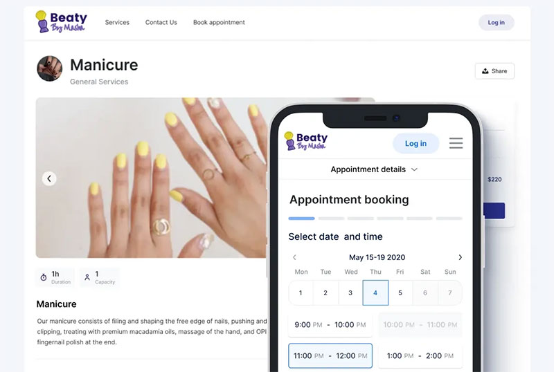
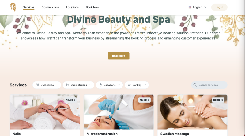
Salon Booking Page Design Example
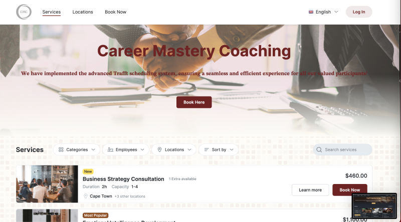
Coaching Booking Page Design Examples
Landing Page Hero
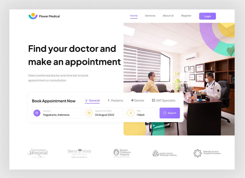
Flower Medical - Hero Section
Website - Tickets page
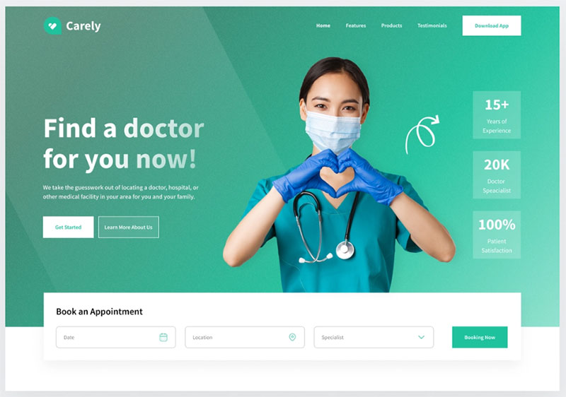
Carely hero
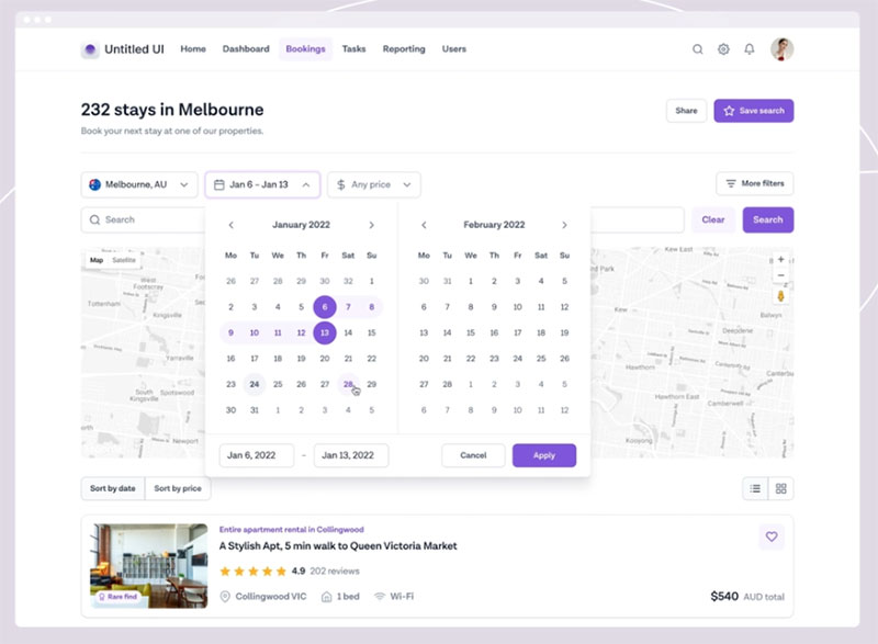
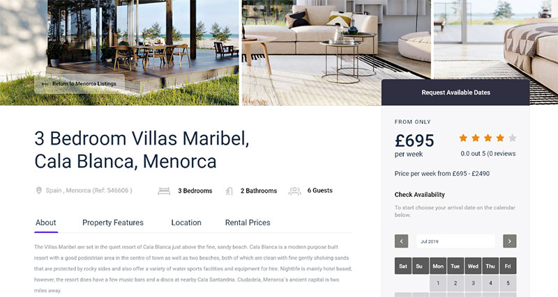
Rental booking website — Untitled UI
The visual appeal of this design lies because the booking page has many elements of the Airbnb website.
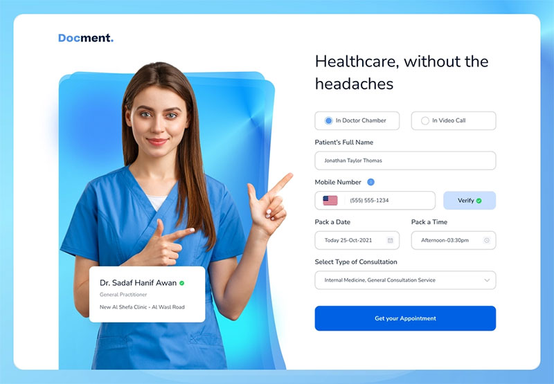
Docment - Appointment Header Concept
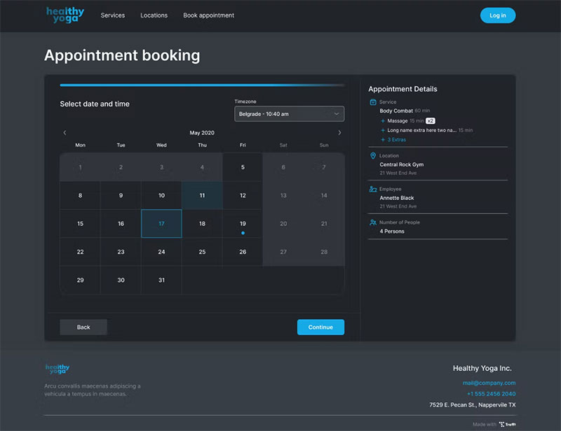
A booking page in dark mode created with Trafft
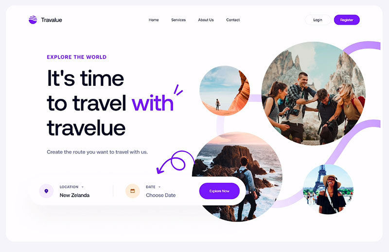
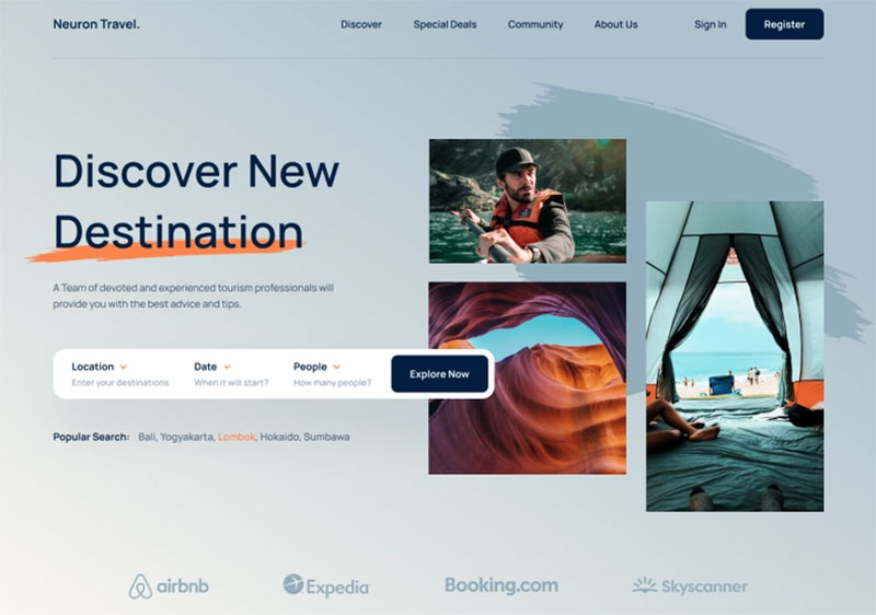
Good Travel Web App Design
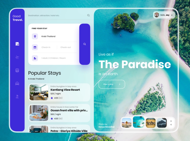
Here you find a presentation of a concept travel web app. It has a unique user interface by Harshil Acharya.
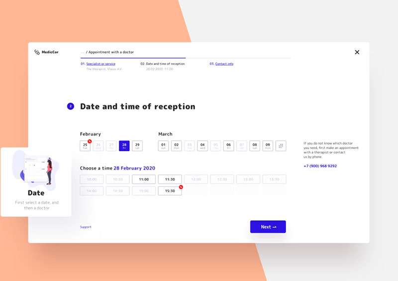
Appointment with a doctor
Hotel Scape Landing Page
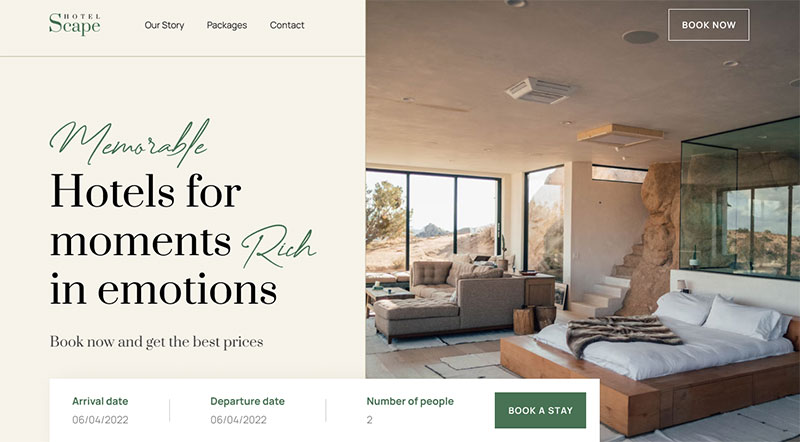
Find inspiration on Taufiq Anshori's hotel booking website.
Booking Website
The designers of this example created a mobile app where you can book apartments. There are various search filters and you can find anything from popular to the most uncommon destinations.
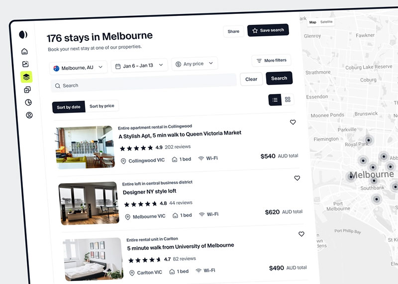
Booking website — Untitled UI
This booking website concept allows you to search for different accommodations.
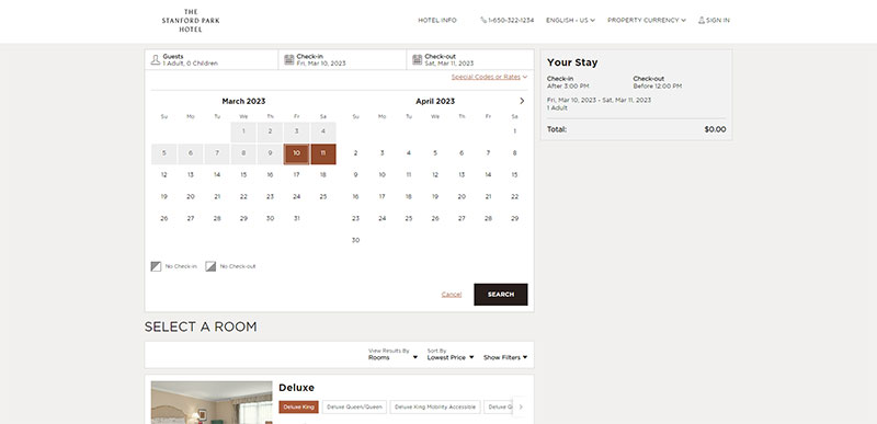
Stanford Park Hotel
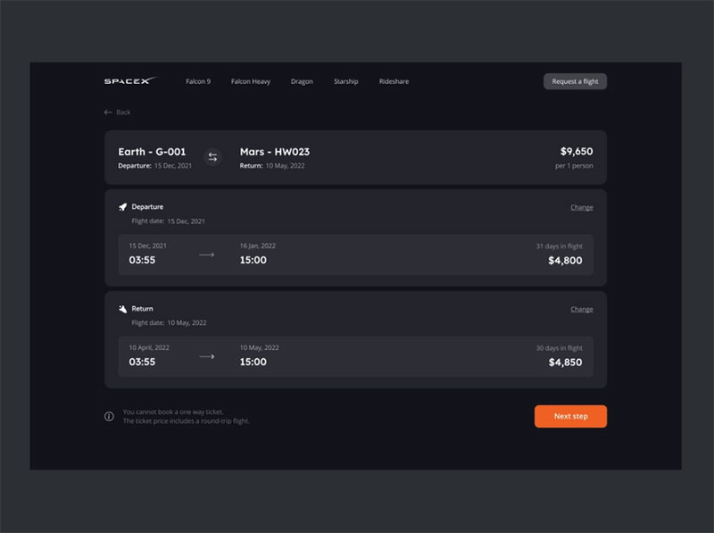
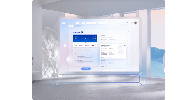
Flight Booking
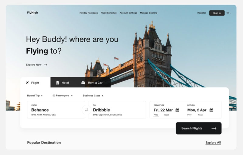
This is another example of a booking page design you can use to promote your services.
Ticket UI for Natural Desktop
The purpose of Gleb Kuznetsov is to offer flight tickets.
One Week Wonders
Hotel Booking Page
Common Booking Page Design Mistakes
Most booking page failures come down to a small set of repeated mistakes.
52% of travelers abandon a booking because of a bad digital experience, not price (SiteMinder Changing Traveler Report, 2025). Design decisions directly cause most of that.
Forced Account Creation
Requiring users to register before booking is one of the most documented conversion killers in checkout UX research.
Baymard Institute's 2024 data shows 24% of shoppers abandon checkout specifically because they're forced to create an account. The fix is straightforward: allow guest booking, offer account creation at the confirmation step instead.
I've seen service businesses lose obvious bookings this way. A user lands on a salon page, picks a time, then hits a registration wall. They close the tab. That booking was done.
Hidden Pricing Until the Last Step
Displaying the full price only at the final checkout step is a trust problem, not just a UX problem.
Users who see a number they didn't expect at step four of a four-step booking form don't just abandon. They often don't come back. Unexpected pricing is cited by Baymard as a primary abandonment trigger across hospitality, events, and service bookings.
The fix: show pricing at point of selection, not point of payment.
Overloaded Booking Forms
The average checkout form has twice as many fields as necessary, according to Baymard's checkout usability research.
Fields that aren't required to confirm the reservation should be removed from the booking form and requested afterward via email. Name, contact, date, and service type are almost always enough to confirm a reservation.
FormStory research shows 27% of users abandon a form because it's too long, and 29% cite security concerns. Both are directly addressable through form design.
No Clear Post-Submission Path
Submitting a booking form and landing on a blank or generic "thanks" page leaves users uncertain.
Did it go through? Will they receive a confirmation? When should they expect to hear back? Without answers to these questions, users often submit again or contact support unnecessarily.
The confirmation flow is part of the booking page design. It needs the same care as the form itself.
FAQ on Booking Page Design
What is a booking page?
A booking page is a dedicated page where users select a service, date, or time slot and confirm a reservation. It differs from a contact form in that it resolves availability and produces a confirmed appointment or reservation directly.
What makes a booking page design effective?
Low friction, visible trust signals, and a clear confirmation path. The best booking page layouts minimize required fields, show pricing upfront, and avoid forced account creation. Booking page conversion drops sharply when any of these elements are missing.
Which tools are best for building a booking page?
Calendly, Acuity Scheduling, YouCanBookMe, and SimplyBook.me handle most use cases well. For WordPress sites, Wix Bookings and Squarespace Scheduling offer native integration. The right choice depends on how much branding control you need.
How do I reduce booking form abandonment?
Cut unnecessary fields, show pricing before the final step, and allow guest booking without account creation. Baymard Institute found 24% of users abandon checkout when forced to register. A single-column form layout also helps on mobile.
What should a booking confirmation page include?
The booking date, time, service, and a reference number. Add a calendar link and a reschedule path that requires no login. Users should not need to wait for an email to confirm their reservation was received.
How important is mobile design for a booking page?
Very. About 60% of hotel reservations in 2024 were completed on mobile (Prostay). Yet mobile booking conversion rates consistently lag desktop. Small tap targets, multi-column forms, and poorly sized date pickers are the main causes.
How can I optimize my booking page for mobile users?
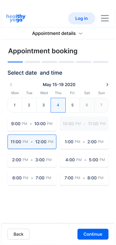
This is how it looks when you're booking an appointment with Trafft on a mobile device.
With responsive design, you can make your booking page fully mobile-friendly and simple to use on any device.
Reduce the need to scroll and make sure everything is legible without pinching.
Making a reservation should be as easy as possible, therefore make sure all buttons and fonts are big and easy to read.
What is the average booking page conversion rate?
For travel and hospitality sites, desktop conversion averages around 7.6% versus 2.6% on mobile (ContentSquare, 2024). For direct hotel websites specifically, most sit below 2%. A rate above 4% places a site in the top 10% of the travel sector.
Should I embed my booking widget or use a hosted page?
Embedding keeps users on your domain and maintains visual consistency with your brand. A hosted page (like a Calendly subdomain) is faster to set up but sends users elsewhere. For client-facing businesses, the embedded scheduling page layout almost always performs better.
What design patterns appear across the best booking page examples?
Persistent price summaries, progress indicators in multi-step flows, visible cancellation policies, and single-column form layouts. Platforms like Airbnb, OpenTable, and Eventbrite each use these consistently, adjusted for their specific reservation system design.
How can I make sure my booking page is secure and trustworthy for customers to use?
Use a reputable payment provider and SSL encryption on your booking page to keep customer information safe.
To ensure clients that their personal and financial data is safe, trust signals like security badges and customer ratings should be displayed.
Make your contact information easily accessible and offer support to help customers with any problems they may be having.
How does booking page design differ by industry?
Appointment pages prioritize time slot clarity. Hotel pages need date range pickers and upfront pricing. Restaurant pages focus on party size and time availability. Ticketing pages add seat selection and urgency signals. Each type requires a different booking form design approach.
Conclusion
This conclusion is for an article presenting real-world booking page design examples across appointments, hospitality, ticketing, restaurants, and SaaS scheduling tools.
The patterns are consistent. Low friction, visible trust signals, mobile-first layouts, and transparent pricing separate high-converting reservation pages from ones that quietly bleed users.
Whether you use Calendly, Acuity Scheduling, OpenTable, or a custom-built scheduling interface, the same rules apply. Fewer form fields. Pricing shown early. A confirmation flow that actually confirms something.
The date picker, the progress indicator, the cancellation policy placement. None of these are small decisions.
Good online booking page design is not about aesthetics. It is about removing every reason a ready user might leave before confirming.