Most service businesses lose leads not because their offer is weak, but because their page is.
The best services landing page examples share a clear pattern: focused messaging, a single call to action, and trust signals placed exactly where visitors need them.
This article breaks down real examples across B2B, local, SaaS, and healthcare categories. You will see what high-converting service page layouts actually look like, what the weak ones get wrong, and how to apply these patterns to your own lead generation page without copying them outright.
What is a Services Landing Page
A services landing page is a standalone or site-integrated page built around a single service offering, designed to move a visitor toward one specific action.
That action could be booking a call, filling out a contact form, or requesting a quote. The page exists to convert, not to inform broadly.
This is where a lot of businesses trip up. They confuse a services landing page with a general "Services" overview page, or treat it like a second homepage. They're different things.
How it differs from other page types
| Page Type | Purpose | CTA Focus |
|---|---|---|
| Services overview page | List all offerings | Multiple, scattered |
| Homepage services section | Introduce the business | General awareness |
| Services landing page | Convert one specific offer | Single, focused action |
The services landing page wins because it removes decision fatigue. There's nothing else to click, no other service to weigh against it.
According to Unbounce data, landing pages with a single CTA achieve a 13.5% conversion rate, compared to 11.9% for pages with multiple competing CTAs.
Core components that define it
Not every page with a form qualifies. A real service landing page has these pieces in place.
- A clear, specific value proposition above the fold
- Minimal or removed navigation to reduce exit paths
- One primary CTA, repeated at logical scroll points
- Trust signals: testimonials, credentials, or client proof
- A description of the service that focuses on outcomes, not just features
Removing the navigation bar alone has been shown to double conversion rates in some tested cases (Yuppiechef, cited by Powered by Search).
What Is the Difference Between a Website and a Landing Page?
A major difference between a services landing page and a website is what their primary focus is.
A website serves to explain what a business does and what it offers to visitors. Websites usually have several pages. Visitors can usually view a homepage, an “about” page, or even blog pages to find the information they are looking for.
A landing page is a standalone webpage with a specific purpose. Its mission is to get viewers to respond to a call to action (CTA). These CTA buttons could be trying to sell a specific service, gain new email subscribers, or register for an event. Landing pages are powerful marketing tools that can adapt to any purpose. The best lead generation landing pages combine a clear promise, a simple form, and one obvious next step.
The majority of successful landing pages have a combination of these elements:
- A headline
- Different subheadings
- Integrated media
- Proof
- Call-to-action buttons
- Sign-up forms
Best Service Business Landing Pages
Campfire Labs
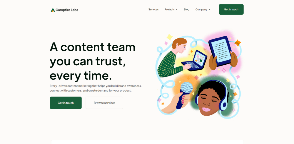
This landing page design is well thought out. The content is story driven and helps to promote their brand and connect them with visitors to their site.
Sophie Dallamore
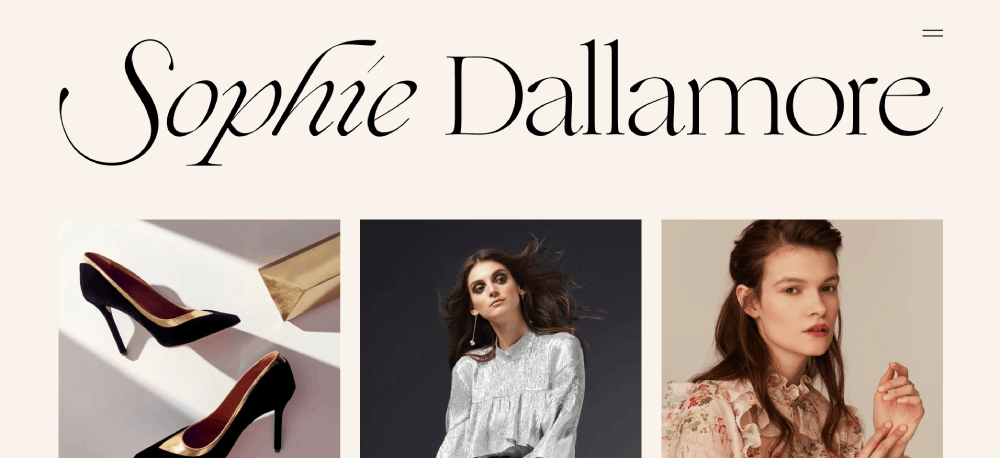
A landing page for a fashion consultant and stylist based in London. This landing page draws attention to the services offered. The skills she is marketing include fashion advice, tips for dressing for an event, and shopping and gifting options.
Sizzer
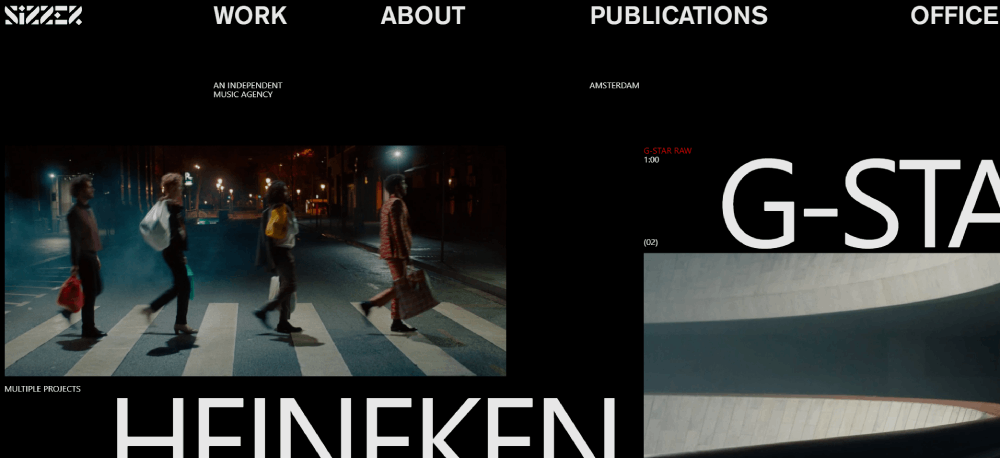
This landing page promotes a company that helps new music artists to create their brand and produce and license their music.
Drift
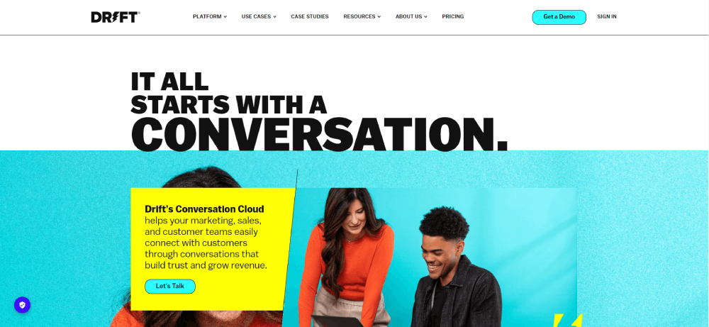
This is a commercial startup company that makes an effort to make communication with clients easy. Their goal in using their services landing page is to make it easy for people to contact them. This makes conversion rates higher among potential customers.
ExpressVPN
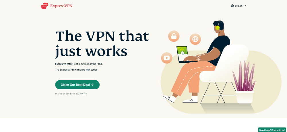
Express VPN is a great example of a dedicated landing page. There is no navigation bar, so a visitor’s only option is to click on the CTA button directly. Without a navigation bar to distract visitors, the landing page does a better job of holding the audience’s attention.
Billy Ragan Roofing
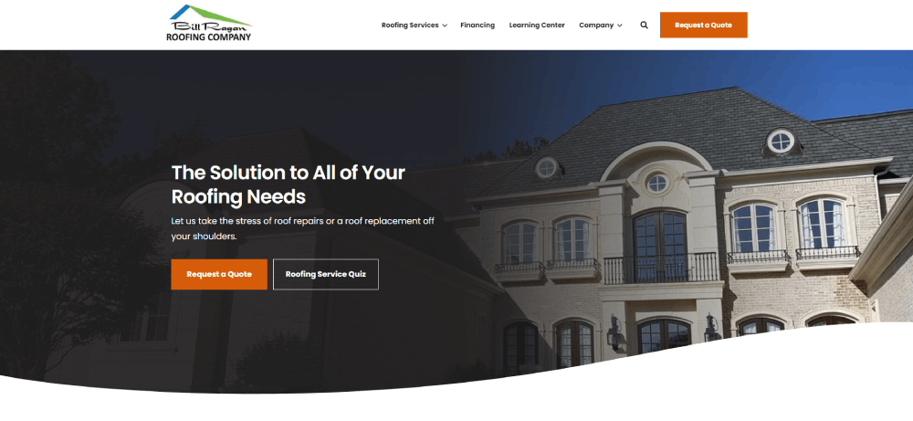
This landing page includes a video from a dedicated team member. This helps site visitors to build trust in the company. It also details every step of the process, from filling out the online form to the finished product.
Create High-Converting Booking Landing Page for Your Service Business
If you’re wondering how to make a landing page and convert visitors into customers with minimal effort, booking software such as Trafft should be your go-to choice.
You get an online booking page generated for you in a matter of minutes. No coding skills required! What’s more, you also get an easily shareable booking form. This means that not only can customers book appointments directly through your website, but you can easily distribute the booking form to potential clients through various channels.
Trafft is not just a mere scheduling tool; it’s professional service business management software and a digital business partner that covers different aspects of running a business.
It’s the kind of app that small and medium business owners, administrators, managers, and key staff in the service industry are using to take their processes and businesses to the next level.
Trafft comes with all the features that you need to get started, such as:
- Automatic online payment processing (including refunds) through multiple providers.
- Two-way synchronization using external calendars (such as Google Calendar and Outlook).
- The ability to create a call-to-action (CTA) booking page in a couple of clicks.
- Group bookings, recurring appointments, and multiple locations.
- The ability to share your available time slots across your social media accounts.
- Client management using customizable email and SMS notifications and reminders.
- Discount/loyalty coupons when managing appointments.
- In-depth overviews of your business performance using key performance indicators.
- The ability for clients to reschedule their appointments with ease.
- Ability to manage bookings, employees, locations, services, schedules, and more.
So, why wait? Sign up for Trafft for free and witness the transformation it brings to your business operations!
BNVC
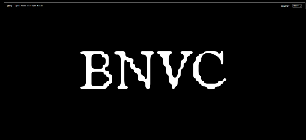
This landing page does a great job of including the relevant content as well as explaining its purpose. Great landing pages include valuable information about what the company represents and how to contact them, and this page does that.
RTY Art
There is something beautiful and unique about the design of this landing page. Through storytelling, the art teacher gets visitors to empathize with the students she works with. She includes a brief summary of what she talked about at the top and bottom of the pages so that visitors can refresh the main points. She also includes testimonials from happy clients. By the end of it, the CTA button has been well marketed so that customers feel motivated to click on it.
SMITH&SAINT
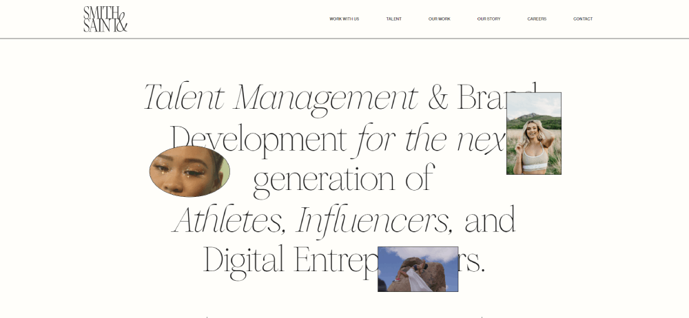
This is a good example of a customized landing page. The company works with a variety of fields, from athletes to influencers, and even digital entrepreneurs. With that in mind, they have created a beautiful, flexible landing page that highlights their portfolio.
Motion For Mobile
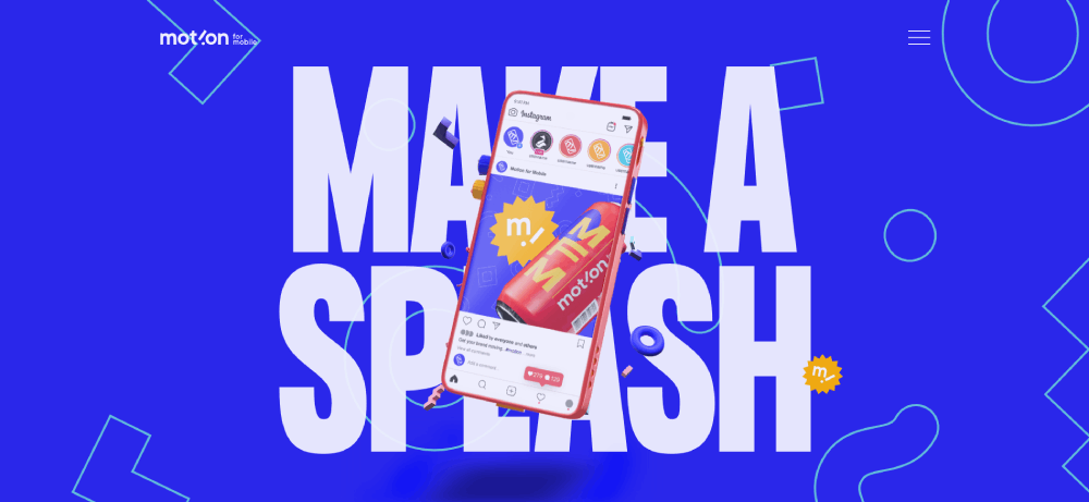
A great example of how to optimize landing pages for mobile devices. This landing page emphasizes social media campaigns and connecting with potential customers online.
Lawn Doctor
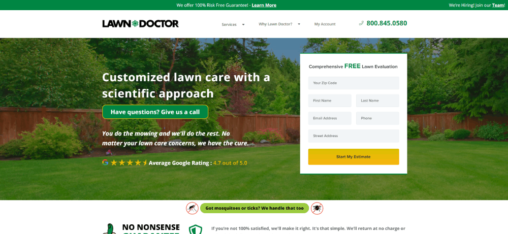
If a locally based company is looking for ideas for their services landing page, this is a good landing page to look at. They started out as a locally based lawn care and pest control company. But now they have grown to more than 630 locations.
Exo Ape

This company based in the Netherlands is a white-glove digital design company. Their landing page offers a glimpse into the work they do. There are links embedded throughout the page where visitors can get more information.
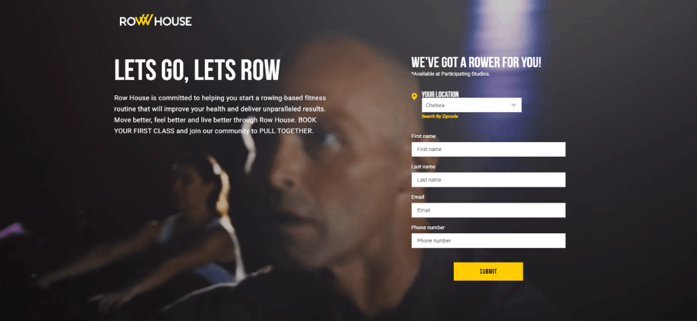
Row House
This business uses visual graphics in a smart way on their landing page. By including images and videos of people working out, they stick to their brand and motivate people to follow the call-to-action buttons.
MasterClass
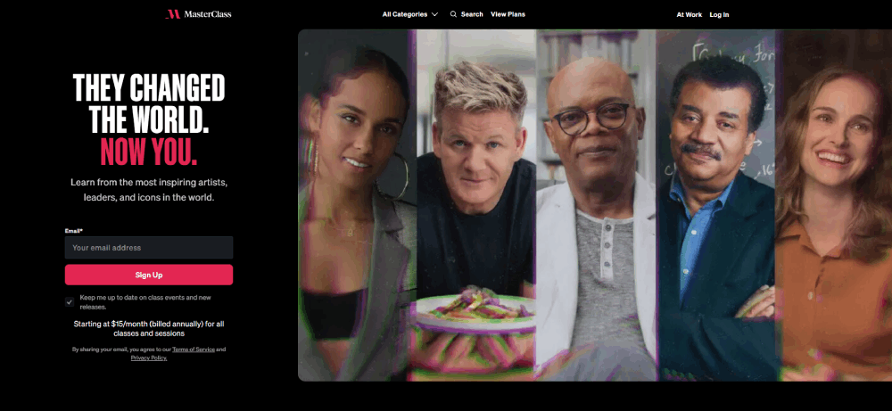
This landing page design does a fantastic job of presenting interesting content to draw people in. Between the highlighted classes and testimonials, this landing page is sure to have great conversion rates. They also make good use of email marketing by including the option to subscribe to their emails right at the top of the page.
Source
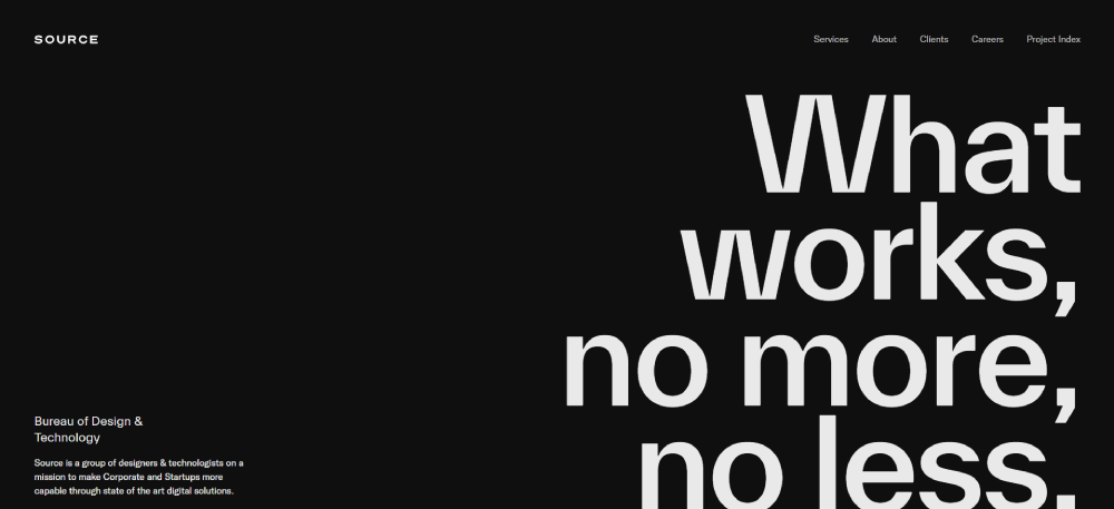
The official landing page for the Bureau of Design and Technology. They state their mission in a clear, succinct way at the top of the page where visitors can find it.
Feather
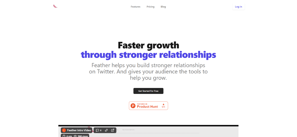
This is a good example of how to keep things simple and straightforward. This landing page design uses a white background and large script to make their point stand out.
Statement
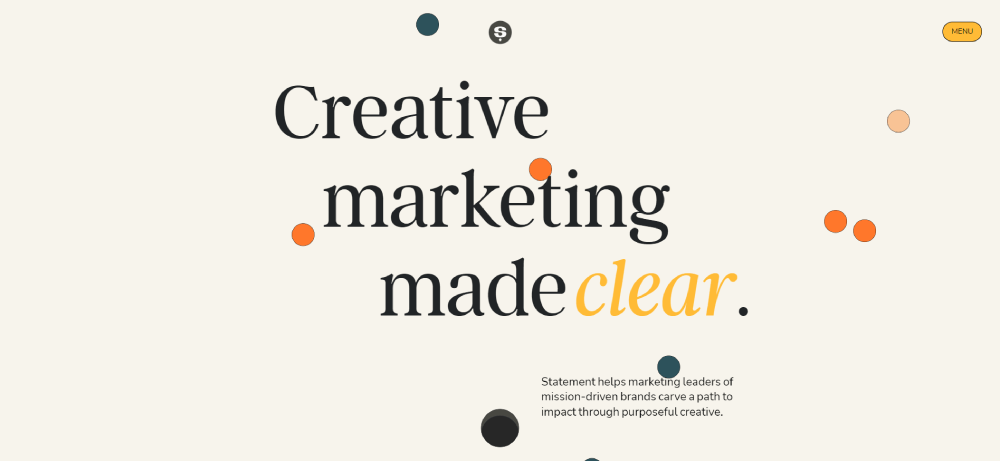
When your goal is to improve the conversion rate of your landing pages, visual design might not seem like a big deal. But this landing page design proves that it’s worth thinking about.
Studies have shown that users form an impression of a website in 0.2 seconds. The impression is largely based on visual factors. This great landing page design uses visual elements to engage visitors and promote their marketing campaigns.
Co-Partnership
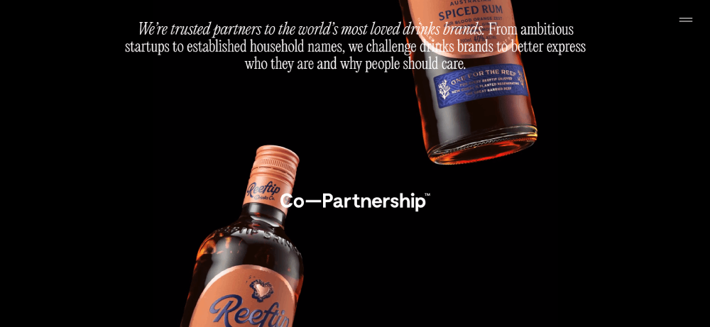
The landing page for this branding and marketing company does more than just generate leads or create beautiful designs. They challenge all drink brands to take their marketing campaign to the next level.
Startup Institute
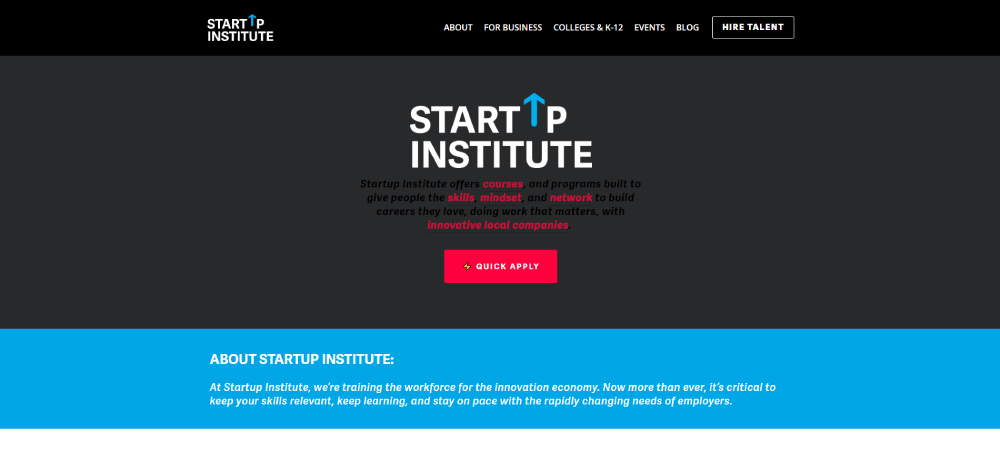
People don’t feel comfortable providing their personal information unless they understand what they are getting out of the exchange. This landing page example provides all the answers to questions that users might have about this company’s services. Apart from the information about courses, there is a Frequently Asked Questions section at the bottom of the page.
Berry Insurance
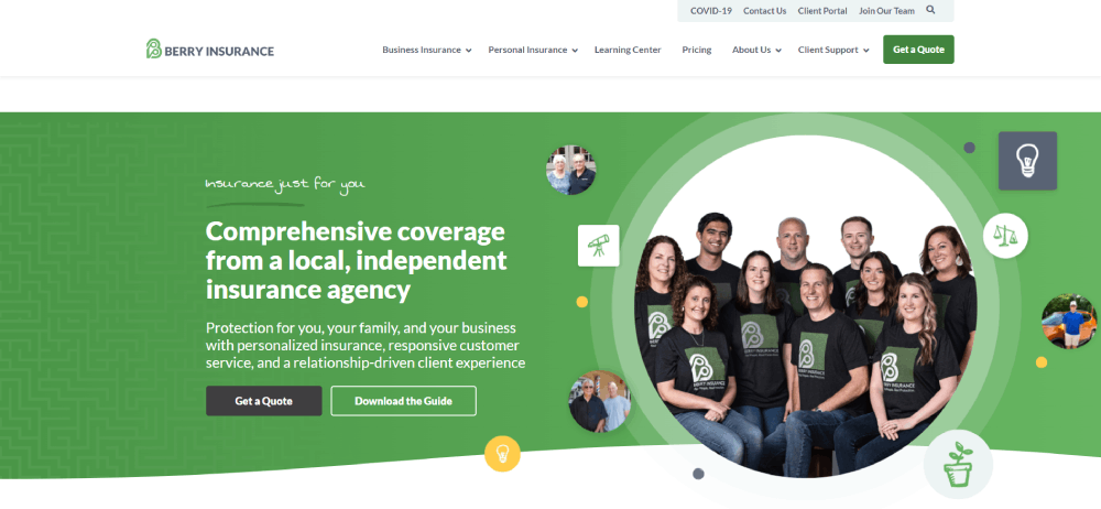
This is a good landing page example with a call-to-action heading. The heading explains what visitors can expect from the landing page. Clients can also reach out with any questions over the live chat.
PrimaHealth Credit
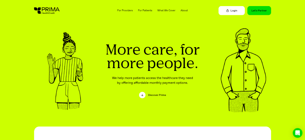
This a good example of a landing page for an affordable heathcare website. They make good use of animated images to catch the visitor’s eye.
BairesDev
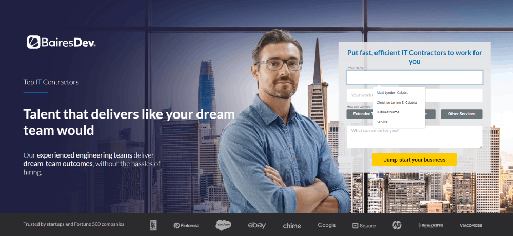
Immediately, this landing page opens with a tasteful combination of visual features and text. Between the short message and the image of a confident-looking man, visitors take away an impression of professionalism. The call to action button is also conveniently located at the top of the page.
Going.com
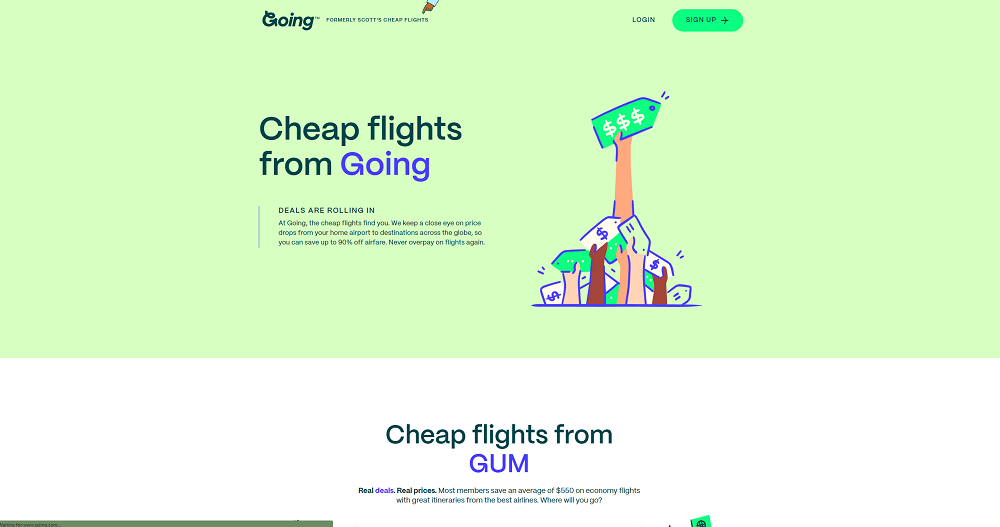
If you are looking for landing page examples that uses illustrations instead of photographed images, take a look at this one.
The site features a minimalist look that appeals to an audience that wants to get right to the point. By using illustrations instead of pictures, they help the audience to get the point. This way, people remember what they saw and read even after they leave the site.
Petplan
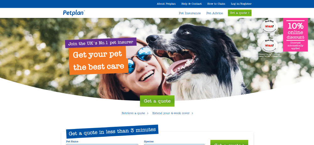
A landing page for a company that offers pet insurance. The goal of the page is to get users to click through by encouraging them to protect their pet. The page uses pictures of cute pets and separate buttons for different kinds of pets to convert visitors.
Anne Helmstadter
This is the landing page of story sales coach Anne Helmstadter. An expert at what she does, the landing page design reflects that same professional vibe.
Because the landing page is for an assessment offer, she doesn’t use images. Instead, she presents her own expertise in an appealing way, and also includes testimonials from past clients. The words she chooses to represent herself and her work are designed to motivate and encourage people to seek out her help.
Jenna Rainey
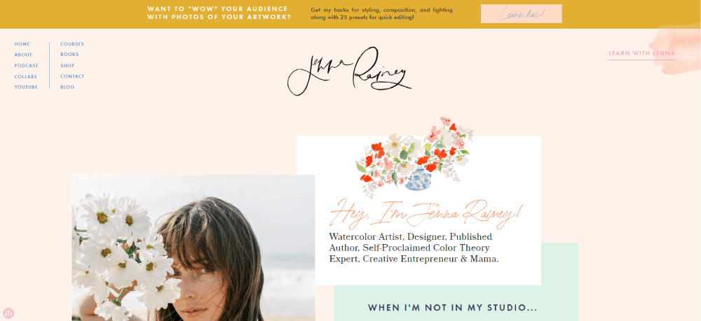
This landing page gets right to the point. In the heading, the visitor learns exactly what they can expect from the course. The artist takes advantage of her opportunity to build rapport with potential customers by introducing herself.
Virgile Guinard

Virgile Guinard is a Paris-based photographer. He collaborates with many well-known companies, such as Chanel, Chloé, Etam, Hermès, Loewe, Prada and Vogue Paris. His landing page design is captivating and compelling. Visitors can see examples of his work by moving the cursor over colored blocks that suddenly take shape as photos.
Yummygum
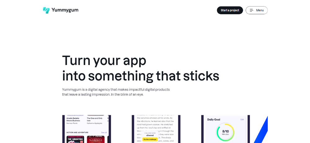
This is a digital services landing page for the Yummygum company. The layout and color scheme of the site is impactful and eye catching.
Custo
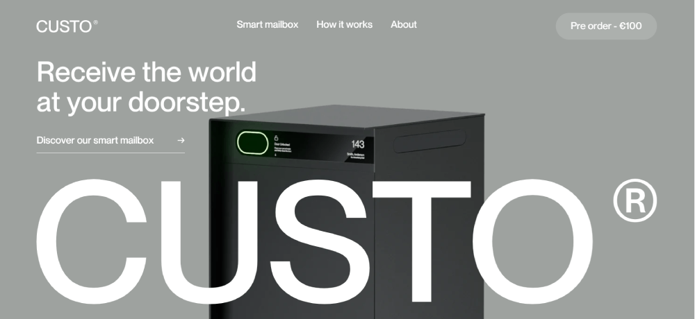
This is a lovely landing page example for companies that want to use landing pages to market their products. All the essential details appear on the page. The information is presented in an appealing way.
Elegant Seagulls
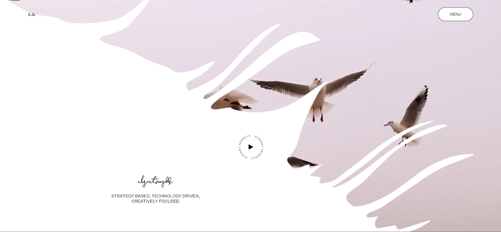
If you are looking for examples of custom landing pages, check out Elegant Seagulls. They have incorporated storytelling into their UI and UX design and into their product design. By doing so, they create beautiful experiences for their customers.
Yopa
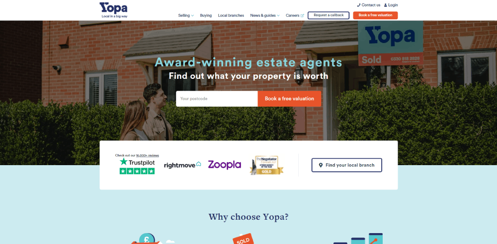
An important element in any landing page is making sure the design works with your theme. Selling or buying a house can be a stressful experience, so Yopa went with a calming blue tone for their landing page and the website. The idea is to put the customer at ease, and make the experience as pleasant as possible.
Mark Manson
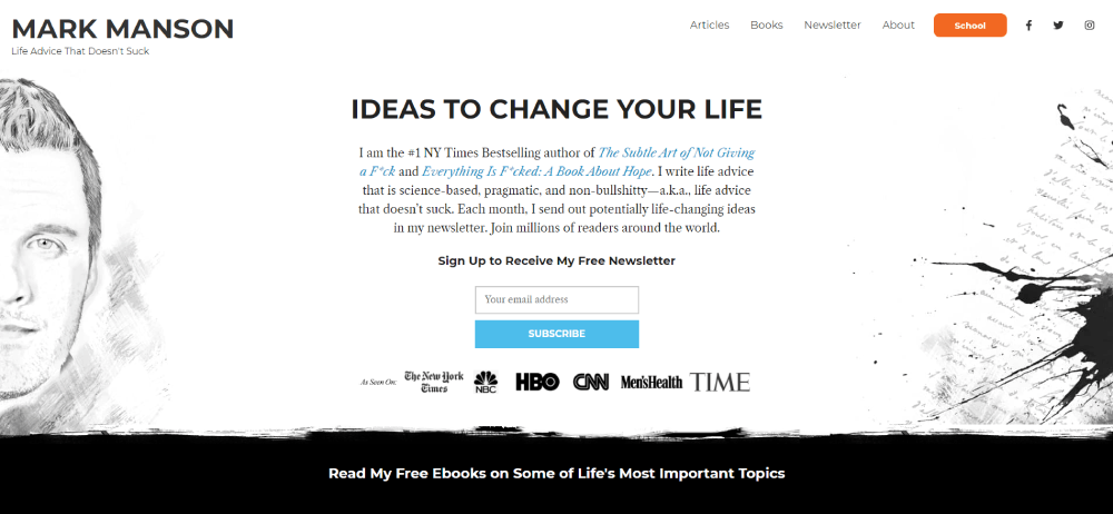
Mark Manson doesn’t hold back from putting his ideas forcefully. Where a business might try to phrase their marketing carefully, on this landing page you will see how he speaks his mind. This lends an air of openness and directness to the landing page that has its own appeal. This is a great page to check out if you are looking for original landing pages.
Mapbox
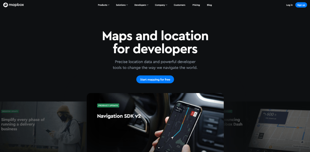
This landing page design is a beautiful example of minimalism. They get straight to the point and provide images to back up their examples. No matter what motivated a visitor to come to the landing page, they can get a sense of how this product will be useful to them.
Freshly
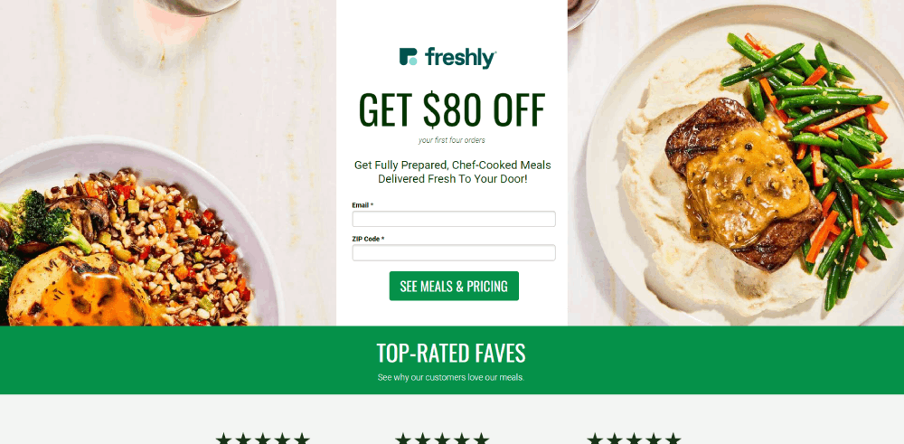
This beautiful landing page is a great example of how good marketing can improve the conversion rate. Throughout the page, mouth-watering pictures of delicious food draw users in and make them want to sign up. The CTA button is conveniently located right at the top of the page so customers have no trouble finding it.
Maltchique
This photographer promotes their business by giving a good overview of their work and portfolio right on the landing page. Visitors can scroll through images of all different media and expressions. This highlights the expertise of the photographer.
Obe Live
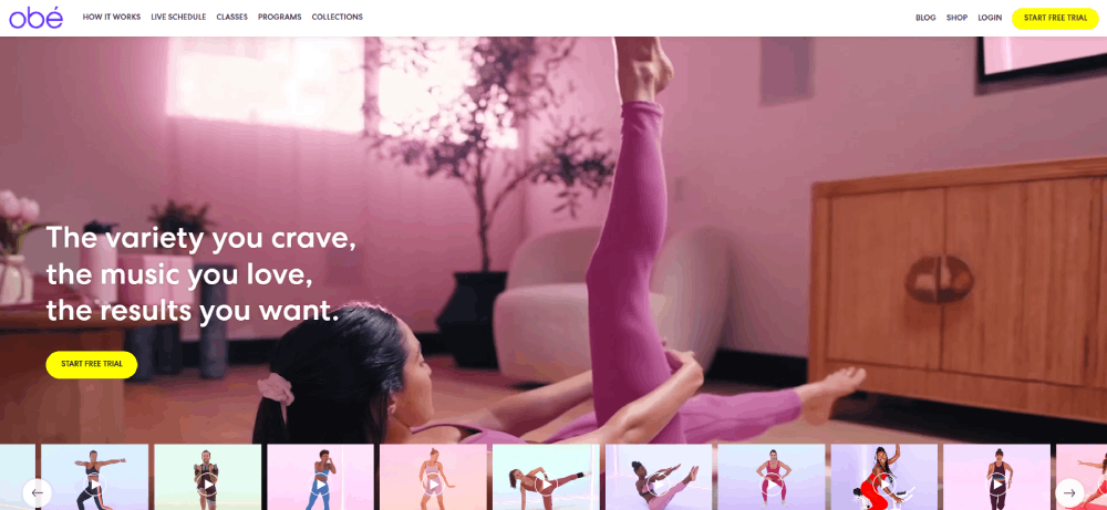
When it comes to marketing, this is one of the best landing page examples of how to show as well as tell. The advertisements show happy people enjoying the Obe experience.
Visitors have the option of choosing several subscription options or doing a free trial.
RoAndCo
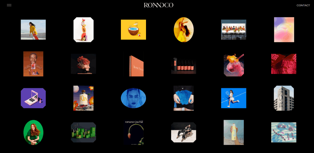
The marketing angle for this page is to convince the customer that this is the best option for them. Whether customers are looking to create their own brand or design a website, RoAndCo asserts that they have just what the customer needs.
Kargo
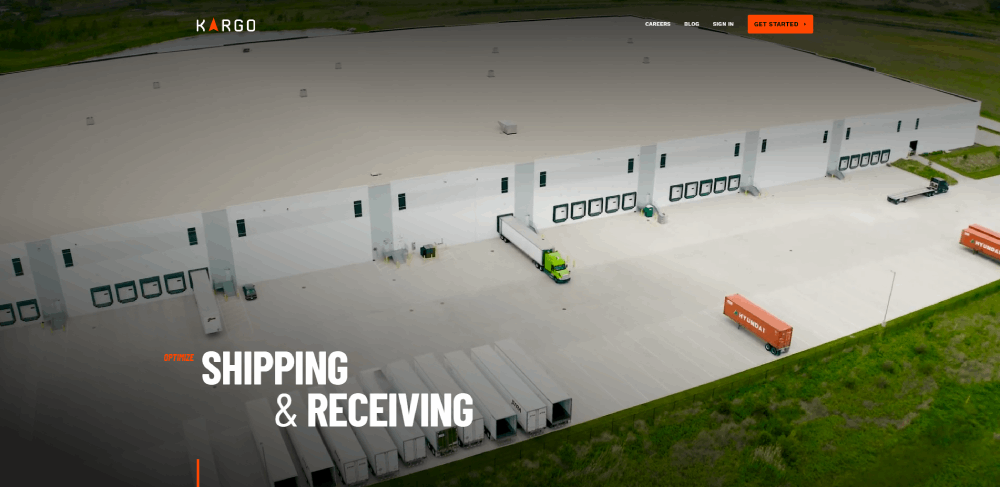
Kargo is a great example of using a landing page to market for a business. They highlight the services they offer and include testimonials from clients.
Semana DevOps

This is another great example of a minimalistic landing page. The company logo takes front and center, and the CTA button is right below.
Wavehuggers
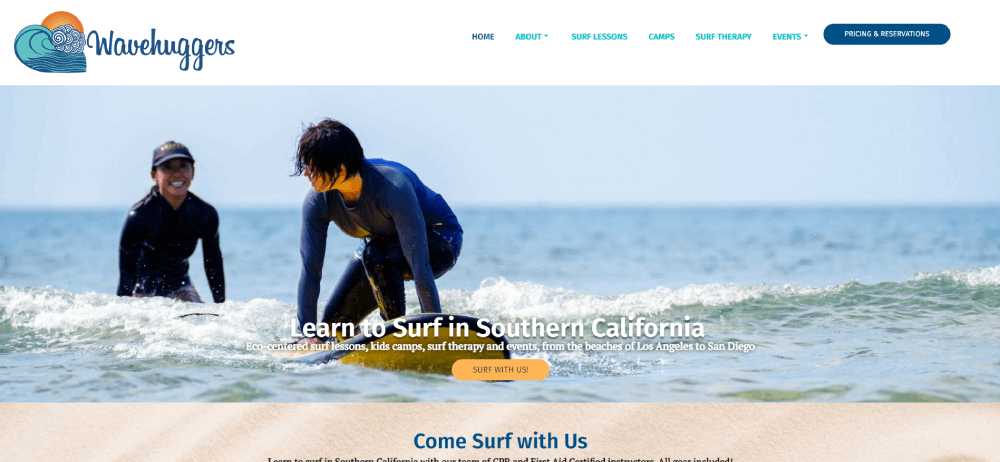
Everything about this landing page design is fun and captivating. It encourages prospective surfers to try something new while reassuring them that they will be safe and have fun. The landing page uses a combination of images and call-to-action buttons to encourage the customer to sign up.
CXL
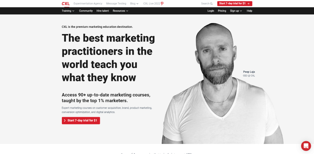
This landing page for a webinar site combines the concepts of a blog post and an FAQ section. Customers visiting the page will feel well informed, and this will encourage them to sign up for courses or webinars.
ast+nebel
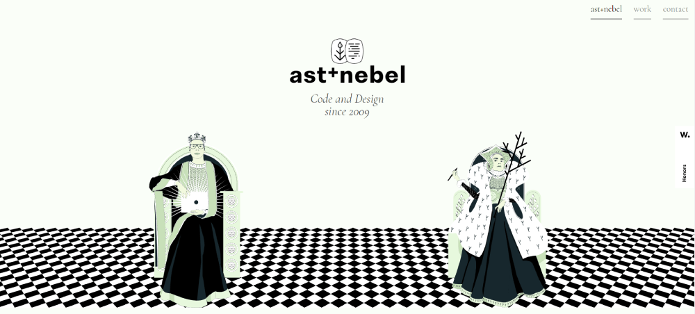
This landing page for a multimedia agency markets their services by making even potential clients feel heard and appreciated.
Shortlist
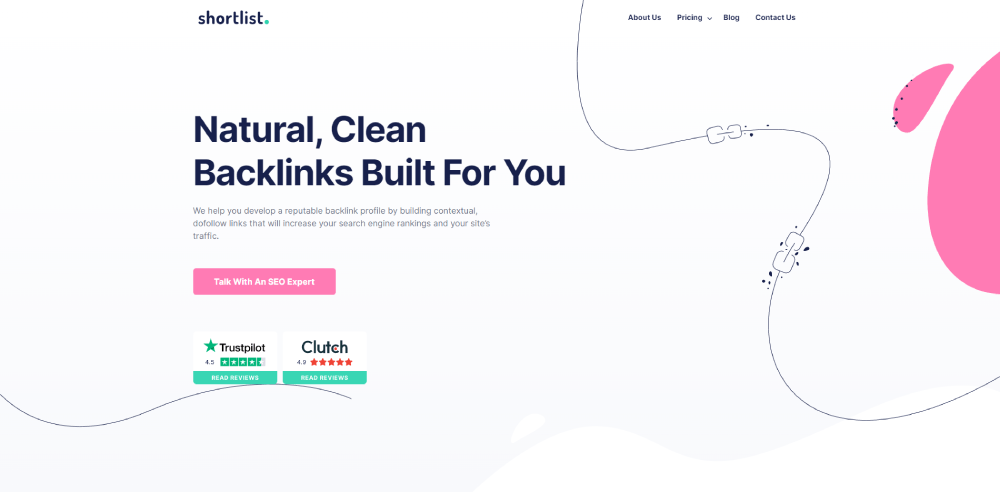
This landing page uses a simple design and muted color tones to put visitors at ease and catch their attention. The company includes insightful information about their work and awards. The landing page also includes testimonials from clients who explain what they like about working with the company.
James Wedmore
Here is an example of how landing pages can adapt to their target audiences. James Widmore starts out by identifying a common problem his audience faces and explaining how he will help overcome it.
Rally
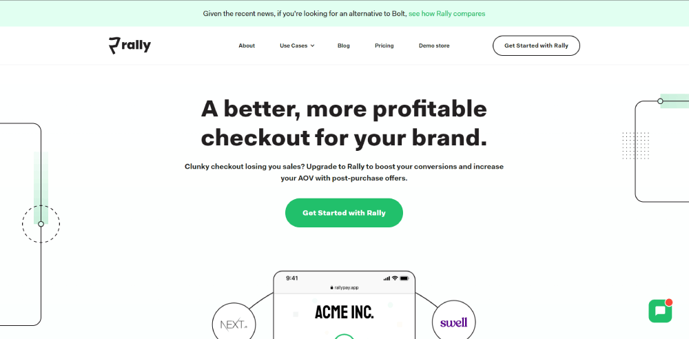
This is a great example of a landing page for marketing. They offer their services to people who are looking to increase their conversion rate.
DigitalMarketer
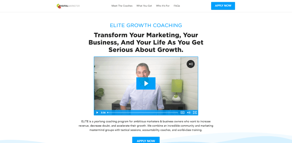
Using videos on landing pages is a great way to help drive a point home. This landing page is a good example of this. Through the video on the landing page, the co-founder and CEO of DigitalMarketer walks viewers through each step of the process and what they can expect.
Litchfield Builders
Here is anoth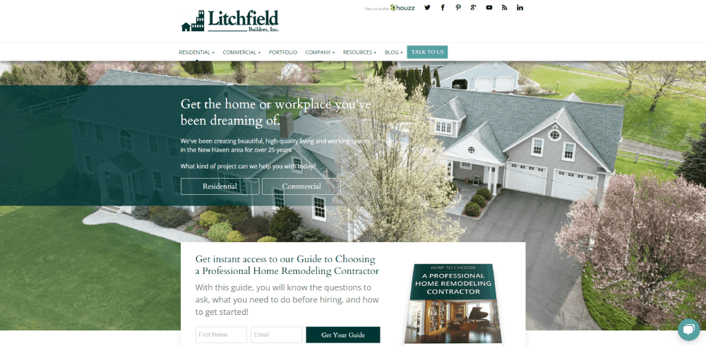 er example of using a video as part of your marketing strategy. A team member explains the benefits of working with them and what customers can expect. They also provide proof of awards and certifications the company has received.
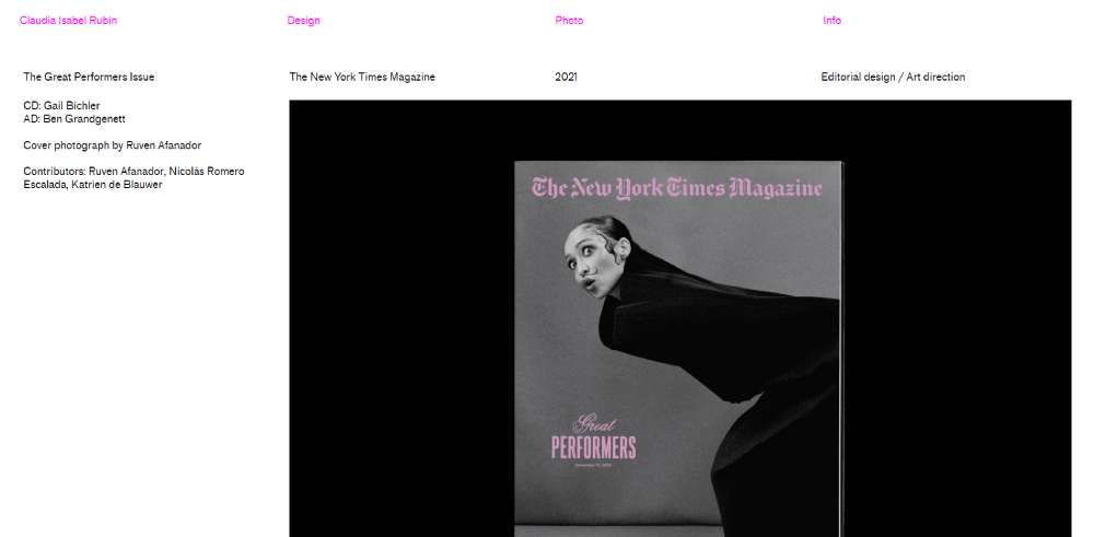
Claudia Rubin
This is a graphic designer’s landing page. On the main page, she provides some examples of the work she has done.
Rob Sobers
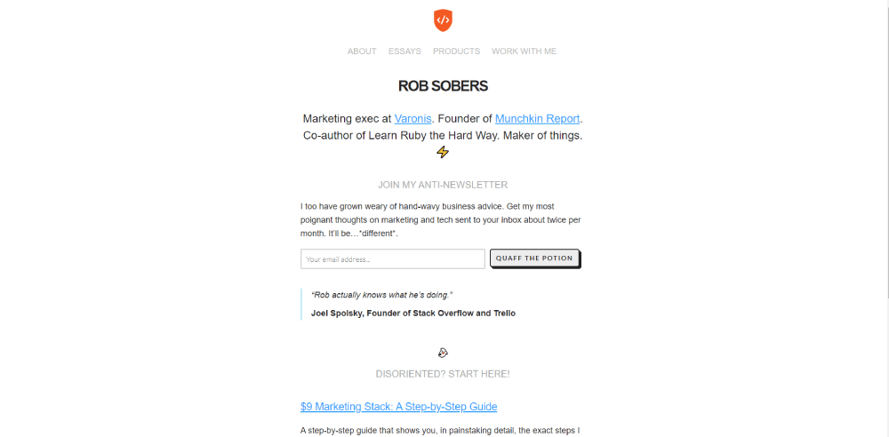
This landing page takes a bit of a different approach. The layout and style are simple and straightforward. Without creating too many visual distractions, he gets his point across and invites people to sign up for his newsletter.
Six
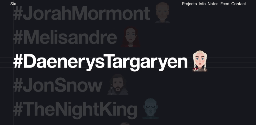
Six is a branding and digital design company. Their landing page keeps the creative flair people expect from a design company. At the same time, they showcase their work to encourage customers to seek out their services.
Product for Net Zero
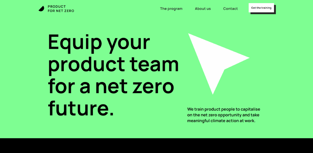
The landing page for Product for Net Zero encourages people to take action to help reduce global emissions. They help people become familiar with climate-friendly alternatives that apply to the business world.
Spacelab
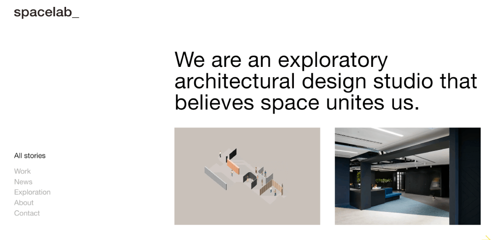
Here is a landing page for an exploratory architectural design studio. Spacelab is a good example of how to use pop up ads in marketing. Each image provides a link that goes into more detail about a different part of the site.
Elite Martial Arts
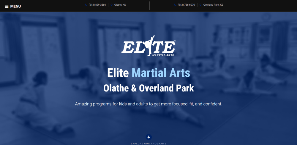
Even small businesses can make use of landing pages for their website. The page is well organized and elegant. This business includes a Frequently Asked Questions section and some noteworthy statistics about the school
What Makes a Services Landing Page Effective
Good design is part of it. But the pages that actually convert well tend to get a few specific things right that have nothing to do with aesthetics.
Unbounce's Q4 2024 analysis of 41,000 landing pages found the median conversion rate across all industries sits at 6.6%. The gap between average and top-performing pages comes down to how well the page handles trust, clarity, and speed.
Value proposition above the fold
Visitors decide within seconds whether a page is for them. The headline and subheadline have to answer three things immediately: what the service is, who it's for, and what they get out of it.
Vague headlines like "We Help Businesses Grow" do nothing. "Accounting Services for E-commerce Brands Doing $1M+" does a lot.
Key difference: Specificity signals relevance. Relevance reduces bounce rate. Simple as that.
Trust signals and their placement
Gartner data shows 90% of people say social proof influences their buying decisions. The question isn't whether to include it but where and what format.
What actually moves the needle:
- Customer testimonials near the CTA (not buried at the bottom)
- Logos of recognizable clients or partner brands
- Specific results in testimonials, not vague praise
- Review ratings pulled from G2, Capterra, or Google
VWO data shows adding testimonials to a landing page drives a 34% lift in conversions. WikiJobs confirmed a similar result in A/B testing: just three short testimonials increased purchases by 34% versus the version without them.
Page load speed
A one-second delay in load time reduces conversions by 7%, according to data cited by Firework.
53% of mobile users abandon a page that takes more than three seconds to load. Given that 82.9% of landing page traffic now comes from mobile devices (Unbounce, 2024), speed is not optional.
Hotjar heatmaps and tools like Google PageSpeed Insights are the fastest ways to identify what's slowing a page down before it costs you leads.
CTA clarity and repetition
Personalized CTAs outperform generic ones by 202% (Wishpond). "Get a Free Quote" beats "Submit." "Book Your Strategy Call" beats "Contact Us."
Repeat the CTA at the top, mid-page, and after any major proof section. Don't make visitors scroll back up to convert.
Common Layout Patterns Across High-Performing Examples
There are patterns that keep showing up across the best service landing pages. Not because everyone copies each other, but because these structures match how visitors actually behave.
Above the fold content gets 84% more attention than anything below it, according to Apexure data from over 3,000 landing pages tested across 300+ clients.
Above the Fold Structure
What high-converting service pages put above the fold:
- Headline that states the specific service and the outcome
- Subheadline that handles the most common objection or clarifies scope
- Primary CTA button, visually distinct from the background
- One trust signal: a review badge, a client count, or a recognizable logo row
Placing content above the fold can improve conversions by around 20%, and a CTA button positioned there specifically can lift conversions by 25% (Wisernotify).
One B2B SaaS company moved its customer logos above the fold, next to the headline instead of leaving them in the footer. Demo requests increased by 24% over six weeks.
Trust and Proof Section Placement
Proof sections don't belong at the bottom. That's where weak pages put them.
Where top-performing pages position proof:
- Directly after the hero section, before the service details
- Adjacent to the CTA, on the same visual line of sight
- Immediately before the pricing or booking section
Testimonials near the CTA drive a 34% conversion lift, according to VWO. That's not a lift from having testimonials. That's specifically from placing them near the action point.
CTA Repetition Patterns
A single CTA at the top isn't enough. Visitors who need more convincing will scroll. The page needs to meet them wherever they stop.
The standard pattern for high-converting service landing pages:
- Primary CTA above the fold
- Second CTA after the social proof or case study section
- Final CTA at the bottom, above the footer
Invesp research shows companies using multiple strategically placed CTAs see a 20% increase in conversion rates compared to single-CTA setups. The key word is "strategically." All three should point to the same action.
Mistakes Found in Weak Services Landing Pages
Most poorly converting service pages share the same handful of problems. Not design issues, mostly. Structural and messaging ones.
The average bounce rate for landing pages sits between 60% and 90% (Sender, citing industry benchmarks). That range is huge, and the gap between 60% and 90% usually comes down to these mistakes.
Vague headlines and weak copy
Difficult words now hurt conversion rates 62% more than they did in 2020, according to Unbounce's 2024 Conversion Benchmark Report analyzing 57 million conversions.
Attention spans have dropped from 2.5 minutes in 2004 to just 47 seconds in 2024 (The Science Survey, cited by Unbounce). Copy that's dense, jargon-heavy, or vague loses people before they even see the CTA.
Common headline mistakes in weak service pages:
- "We Help Businesses Succeed" (who doesn't?)
- A company tagline where a value proposition should be
- Leading with the service name, not the outcome
Too many CTAs competing
Multiple conflicting CTAs on one page are a known conversion killer.
A lead gen form, a chat widget, a newsletter signup, and a "view our portfolio" link all on the same page? Visitors freeze. They end up doing nothing.
Pages with a single, clear CTA achieve a 13.5% conversion rate, compared to 11.9% for pages with multiple competing ones (Unbounce). The difference sounds small. Over thousands of visitors, it adds up fast.
No social proof or outdated testimonials
Missing proof is expensive. 95% of consumers read reviews before making a purchase (Wisernotify). No testimonials, no case studies, no review count? That's a trust gap most visitors won't cross.
Outdated proof is almost as bad. A testimonial from 2019 with no date, or a case study from a company that no longer exists, signals neglect.
What a credible proof section looks like:
- Full name, role, and company on every testimonial
- Specific result mentioned ("reduced onboarding time by 3 weeks")
- Recent date, or at minimum a visible recency signal
Slow load time and poor mobile layout
Professional services pages convert 40% better on desktop, yet receive 4x more traffic from mobile (Unbounce, 2024 Conversion Benchmark Report). That gap costs real leads every day it goes unaddressed.
A one-second delay in page load time reduces conversions by 7%. Mobile visitors are 123% more likely to bounce when load time increases from one second to ten seconds (Sender).
Tools like Google PageSpeed Insights, Hotjar, and Crazy Egg are the fastest ways to see exactly where mobile visitors drop off before spending on traffic.
Tools Used to Build Services Landing Pages
The tool matters less than most people think. What matters is whether it lets you test quickly, integrate your forms, and load fast on mobile. That said, the tools aren't interchangeable.
| Tool | Best For | Key Strength |
|---|---|---|
| Unbounce | Conversion-focused marketers | AI traffic optimization, A/B testing |
| Webflow | Design-heavy service brands | Custom forms, visual control |
| Instapage | Teams running multiple campaigns | Collaboration, AdMap, analytics |
| Leadpages | Freelancers and small businesses | Low cost, easy setup |
| Elementor (WordPress) | WordPress-based service sites | CMS flexibility, plugin ecosystem |
Page builders vs. building within your CMS
The short version: dedicated landing page tools win on speed. CMS-native builds win on SEO and long-term flexibility.
Unbounce's Smart Traffic feature routes visitors to the best-performing page variant automatically. Some users have seen conversion jumps of up to 30% from this alone (Unbounce). It's hard to replicate that inside a standard WordPress setup without significant custom work.
Webflow handles complex form logic without code. Conditional fields, file uploads, dropdown menus. For service businesses where the intake form is part of the qualification process, that matters.
CRO and testing tools
Building the page is step one. Testing it is where actual performance gains happen.
77% of businesses worldwide use A/B testing on their websites (VWO). Only 1 in 8 tests produces a statistically significant result, so testing volume and patience both matter.
Tools that support proper testing:
- Hotjar: heatmaps and session recordings to see where users stop
- VWO: A/B and multivariate testing with statistical significance controls
- Crazy Egg: click maps and scroll depth, no-code variation editor
Form and booking integrations
Calendly is the default for service businesses that want a frictionless booking flow. Drop it directly on the landing page. No redirect, no extra click.
HubSpot forms work well when the business needs CRM integration from the first touchpoint. Every form submission flows straight into a contact record, no manual entry.
Typeform performs well for multi-step service intake forms. The conversational format reduces the friction that comes with long single-page forms, which matters because multi-step forms can improve completion rates by up to 14% compared to long single-form layouts (Wisernotify).
How to Use These Examples Without Copying Them
Looking at a good landing page and copying its layout is the fastest way to end up with a page that looks right but converts poorly. The structure of a page works because of who it's for and what they need to hear. That context doesn't transfer.
Companies testing 10 or more page variations see 86% better results than those running a single test (Conversion Sciences, cited by Genesys Growth). The advantage isn't in having the right first version. It's in testing enough iterations to find it.
Auditing your own page against what you've seen
Start here. Open your highest-traffic service landing page and ask these four questions:
- Does the headline state who this is for and what they get?
- How many form fields are there? (If more than 5, that's the first thing to fix)
- Is there a testimonial within scrolling distance of the CTA?
- What does this page look like on a phone?
Most pages fail at least two of these. Fix one at a time, not all at once.
Matching layout decisions to your audience
Sales cycle length changes everything. A local cleaning service and an enterprise IT consulting firm both need service landing pages, but they're built completely differently.
Short sales cycle (home services, personal training, local bookings): lead with a phone CTA and booking form. Get out of the visitor's way fast.
Long sales cycle (B2B consulting, legal, financial): lead generation is the goal, not an immediate booking. A low-commitment CTA ("Download the Guide," "Book a 15-Minute Call") outperforms "Buy Now" or "Get Started" in these categories.
Testing one variable at a time
This is where most optimization efforts break down. Someone reads a case study about video increasing conversions by 86%, adds a video, changes the headline, tweaks the form, and then has no idea what moved the needle.
Roughly 60% of companies run A/B tests on their lead generation landing pages (according to Leadpages). Of those, most run fewer than five tests per page per year. That's not enough to move from median to top-quartile performance.
Test priority order, based on conversion impact:
- Headline copy (highest leverage, fastest to change)
- Form field count
- CTA text and color
- Proof placement
- Page structure and layout
One test at a time. Give each one enough traffic to reach statistical significance before declaring a winner. Hotjar session recordings are useful here: they show whether visitors are reading the new version or bouncing before they even get to the changed element.
FAQ on Services Landing Pages
What should a services landing page include?
A strong service landing page needs a clear headline, a single call to action, trust signals, and a focused service description.
Social proof, a contact form, and benefit-driven copy are non-negotiable. Keep navigation minimal to reduce exit paths.
How long should a services landing page be?
Long enough to address objections, short enough to keep visitors moving.
For simple local services, one screen can work. For B2B consulting or SaaS, a longer page with case studies and a lead capture form performs better.
What is a good conversion rate for a service page?
The median landing page conversion rate across industries is 6.6%, according to Unbounce's 2024 data.
B2B service pages average 13.28%. Anything above 10% is solid. Top-performing pages in professional services regularly exceed that.
How is a services landing page different from a homepage?
A homepage serves multiple audiences. A services landing page targets one specific visitor with one specific offer.
It removes navigation distractions, focuses on a single value proposition, and pushes toward one action. Homepages rarely convert as well as dedicated pages.
What makes a B2B services landing page effective?
Specificity. A weak B2B page describes what the service is. A strong one states who it helps and what outcome they get.
Case study summaries, client logos, and a low-commitment CTA like "Book a 15-Minute Call" outperform generic contact forms.
Should a services landing page have a form or a phone number?
Depends on the service. Local and home service pages convert better with a click-to-call button above the fold.
B2B and SaaS pages typically perform better with a short form. Calendly-style booking widgets reduce friction for both.
How many CTAs should a service landing page have?
One primary action, repeated at logical scroll points. Top, mid-page, and bottom.
Multiple competing CTAs hurt conversions. Pages with a single focused CTA achieve a 13.5% conversion rate versus 11.9% for pages with several conflicting ones.
What tools are used to build service landing pages?
Unbounce, Webflow, Instapage, and Leadpages are the most common dedicated page builders.
WordPress with Elementor works well for service businesses already on that CMS. Calendly and HubSpot handle booking and lead generation integrations on most platforms.
How do you add trust to a service landing page?
Use testimonials with full names, roles, and specific results. Add client logos, review ratings from G2 or Capterra, and any relevant certifications.
Position proof near the CTA, not buried at the bottom. Testimonials placed near the action point drive a 34% conversion lift.
How do you test if a service landing page is working?
Start with your conversion rate and bounce rate. Use Hotjar heatmaps to see where visitors stop scrolling.
Run A/B tests one variable at a time, starting with the headline. Give each test enough traffic to reach statistical significance before drawing conclusions.
Conclusion
This conclusion is for an article presenting services landing page examples across B2B, local, SaaS, and healthcare categories.
The patterns are consistent. High-converting service pages lead with a specific value proposition, place social proof near the CTA, and keep form fields to a minimum.
Whether you are building a consulting landing page, a booking page for a home service business, or a lead generation page for a SaaS product, the same principles apply.
Use the examples as a reference point, not a blueprint. Audit your own page layout first, test one variable at a time, and let conversion data guide the decisions.
Good pages are not built once. They are tested into shape.