




Barbershop logo ideas are a collection of logo design concepts that apply barbershop-specific iconography, such as the barber pole, razor, and scissors, instead of generic business symbols.
Individual shop owners, chains, and mobile barbers all rely on this visual shorthand to signal trade and trust before a customer ever sits in the chair.
More than 154,000 barbershops now operate across the US, according to IBISWorld's 2025 industry data, competing for attention with a similar pool of poles, blades, and combs.
A distinctive icon, paired with a deliberate color palette and a fitting typeface, separates one shop's mark from the rest of that crowd.
What Is a Barbershop Logo?
A barbershop logo is a visual mark that identifies a men's grooming business through symbols, color, and type tied to the barbering trade.
It works differently from a generic business logo because it borrows straight from tools of the trade instead of abstract shapes.
Core elements a barbershop logo typically combines:
- A trade symbol: barber pole, razor, scissors, or clippers
- A color palette rooted in the classic red, white, and blue pole, or a modern black and gold scheme
- Typography that leans vintage serif, hand-lettered script, or bold sans-serif
Truefitt & Hill, recognized by Guinness World Records as the oldest barbershop in the world, still trades on a heritage identity built over two centuries rather than a trend-driven mark.
The visual language behind a hair salon logo usually leans softer, think flowing lines and pastel tones. A barbershop mark leans into masculine, trade-tool imagery on purpose.
Once the design is locked, it still has to work small: on a business card, a window decal, and eventually a Vistaprint sign order.
Common Symbols Used in Barbershop Logo Design
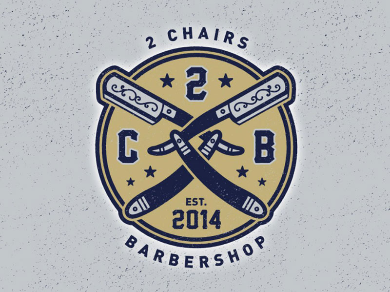
Image source: Wade Ryan
Every barbershop symbol on a modern logo design traces back to tools the trade has used for centuries.
The red, white, and blue barber pole is the clearest example. Its stripes date to 1163, when Pope Alexander III barred clergy from performing bloodletting and barbers took over the practice, with red representing blood and white the bandages (History.com).
Trade-tool icons used most often:
- Straight razor, shown mid-shave or crossed with scissors
- Scissors, alone or paired with a comb
- Mustache or beard icon, common on hipster-style shops
- Hair clippers, often drawn from real clipper silhouettes similar to Andis or Wahl models
Some shops work a shaving brush or a Barbicide jar into the mark, a nod to the blue sanitizing liquid every licensed barber keeps on the counter.
Stock icon sites like Vecteezy and Freepik sell barber-specific vector packs, useful for a rough first draft before anyone refines the artwork.
A logo built around negative space, like a razor hidden inside a scissor blade, reads as more custom than a stock clip-art icon.
Barbershop Logo Styles and Formats
Barbershop logos fall into a handful of recognizable styles, each suited to a different kind of shop.
Format matters as much as style. A wordmark, an emblem, and a combination mark behave differently once printed small on a card or embroidered on a cap. Creating a good logo means accounting for those different uses from the start, rather than designing for a storefront first and trying to make the same mark work everywhere else later.
Pinterest, Behance, Dribbble, and LogoLounge are worth an afternoon of browsing before committing to a direction, just to see what's already been done to death.
Vintage and Badge Styles
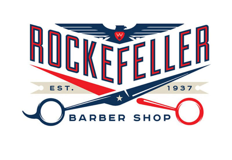
Image source: Pants Pantsley
Vintage badge marks place a trade icon inside a circular or shield-shaped emblem, often ringed with the shop name in hand-lettered type.
This is the most common style choice for a shop that wants to signal decades of experience, even in its first year.
- Pros: instantly reads as barbershop, works well on signage and apparel
- Cons: gets visually busy at favicon size, harder to simplify later
Floyd's 99 Barbershop switched to a black-and-white badge mark after dropping a city-skyline inlay from its original logo, a change made specifically to protect the trademark (American Salon).
Minimalist Styles
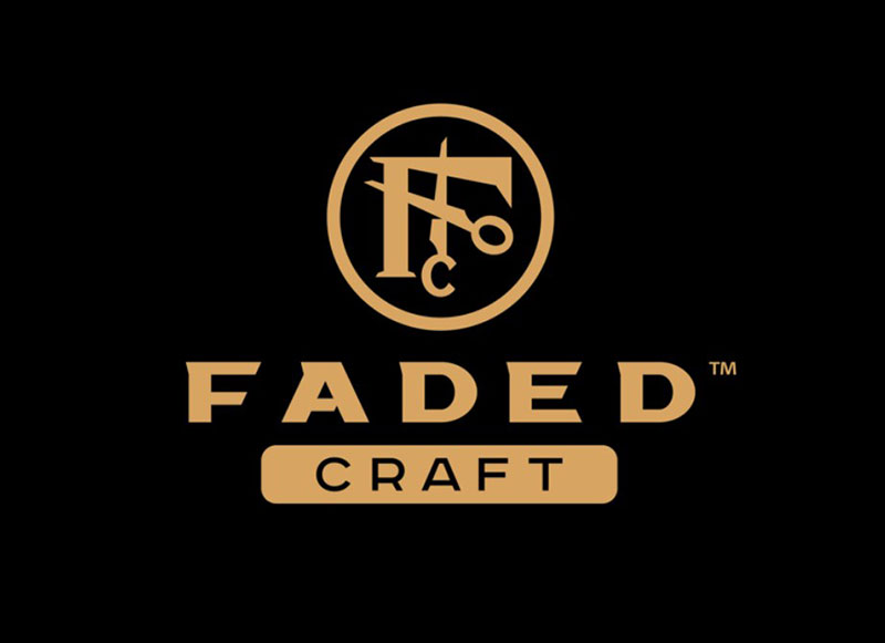
Image source: raul sigala
A minimalist barber logo strips the mark down to one icon, one typeface, and one or two colors.
A personal trainer's logo often gets the same treatment, since one clean icon scales better across an app, a shirt, and a business card than a detailed badge does.
- Fast-growing chains that need the mark to work across many storefronts
- Modern grooming lounges positioned away from old-school barbering
The trade-off runs the other way from a vintage badge. What a minimalist mark gains in scalability, it can lose in personality if the icon isn't distinctive on its own.
Mascot and Emblem Styles
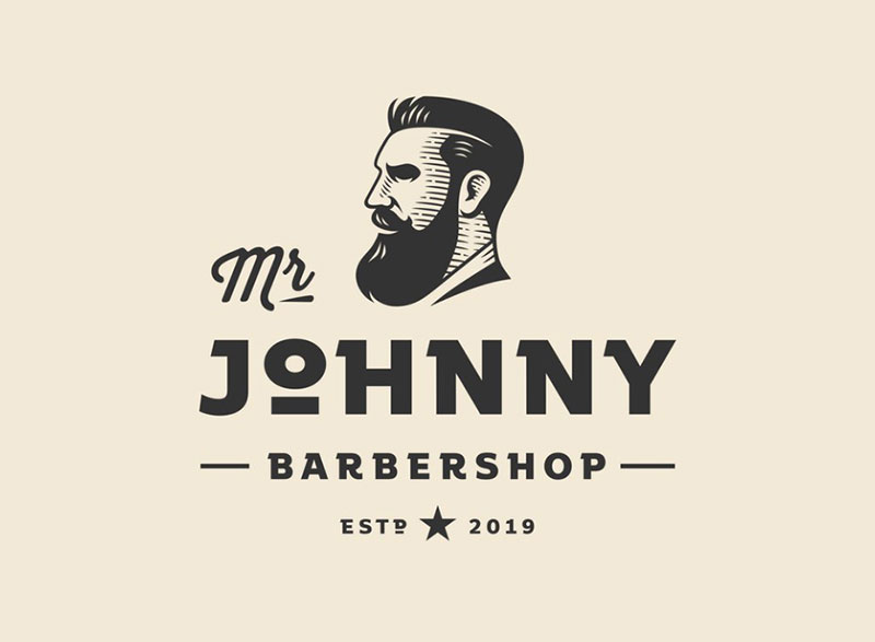 Image source: Zvucifantasticno
A mascot logo puts a character, often an illustrated barber, a bulldog, or a stylized mustache face, at the center of the mark.
Emblem marks work similarly but swap the character for a crest, a shield, or a monogram built from the shop's initials.
Where each format tends to show up:
- Mascot marks: neighborhood shops building a playful, memorable identity
- Emblem marks: multi-location chains that need one flexible crest
Gyms reach for the same approach, often trading the barber icon for a gym logo built around a dumbbell or a bicep.
Mascot marks cost more to illustrate well and age faster stylistically than a clean emblem, so they suit a shop chasing personality over decades-long longevity.
Barbershop Logo Color Palette Ideas
Color carries more weight in a barbershop logo than most owners expect.
Key figures on color and branding:
- Color increases brand recognition by up to 80% (University of Loyola, Maryland study)
- 34% of the world's top 100 brands use black in their logo, more than any other color (Reboot Online analysis)
- Red and blue tie for second, each used by 30% of those same top 100 brands (Reboot Online analysis)
A barbershop palette usually pulls from one of three directions.
- Red, white, and blue: the classic barber pole combination, ties the shop to trade history
- Black and gold: signals a premium, upscale grooming lounge
- Monochrome or two-tone: keeps signage legible from a distance and prints cleanly in one ink color
Pantone reference numbers keep a chosen palette consistent across a printed sign, a website, and an embroidered patch.
Test every option in solid black before finalizing it. Most stamps, engravings, and single-color print jobs strip color out entirely.
Fonts and Typography for Barbershop Logos
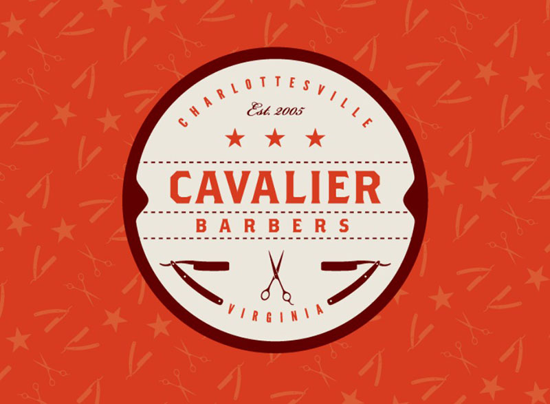
Image source: Joel Messner
Font choice signals the shop's personality as clearly as the icon sitting next to it.
Typography styles that show up most in barbershop logos:
- Vintage serif: slab serifs and condensed serifs read as established and trustworthy
- Script: hand-lettered or brush script adds a personal, barber-as-craftsman feel
- Bold sans-serif: clean geometric sans fonts read as modern and minimal
Google Fonts and Adobe Fonts both carry free and licensed options in each category, which keeps typography costs separate from the icon design budget.
Pairing rules matter more than font choice alone. A vintage serif logotype paired with a script tagline reads as intentional.
Two competing scripts stacked on top of each other read as cluttered.
Keep the shop name in a font weight that still reads clearly at business card size, before locking in anything ornamental.
Which Barbershop Logo Style Fits Your Shop?
The right style depends on the kind of shop behind the logo, not on whatever look is trending this year.
Match the mark to how the shop actually operates day to day.
| Shop type | Best-fit style | Typical symbol | Typical palette |
|---|---|---|---|
| Traditional neighborhood shop | Vintage badge | Barber pole or razor | Red, white, and blue |
| Modern grooming lounge | Minimalist | Simplified scissors or comb | Black and gold, or monochrome |
| Mobile or traveling barber | Wordmark-only | None, or a tiny icon | Two-tone, high contrast |
| Multi-location chain | Emblem or combination mark | Monogram or crest | Consistent across every location |
A mobile barber benefits from a lighter mark, since it has to work on a van decal as easily as a phone screen.
Matching the logo to the shop's interior design choices keeps the brand consistent from the window sign to the chairs inside.
A shop that changes concept every year, say from classic barber to a hybrid barber-and-bar, should lean minimalist. A simple mark is cheaper to tweak than a detailed badge.
DIY Logo Maker vs. Freelance Designer vs. Professional Agency
Three paths lead to a finished barbershop logo, and each trades speed and cost for customization. An AI logo generator adds another fast starting point for owners who want to test several concepts before paying a designer to refine one.
The median hourly wage for an employed graphic designer in the US sits at $29.47, according to the Bureau of Labor Statistics (May 2024), which is the baseline every freelance and agency rate gets measured against.
| Method | Typical cost | Turnaround | Customization |
|---|---|---|---|
| DIY logo maker (Canva, Looka, Tailor Brands, Hatchful, Wix Logo Maker) | Free to around $65 for full vector files | Minutes to an hour | Low, template-based |
| Freelance marketplace (Fiverr, Upwork, Etsy templates) | $5 to a few hundred dollars | 2 to 7 days | Moderate, depends on the designer |
| Design contest platform (99designs) | $249 to $2,499 published tiers | 1 to 2 weeks | High, multiple concepts to choose from |
| Professional design agency | Highest of the four, quote-based | 2 to 6 weeks | Highest, full brand system included |
99designs publishes contest pricing from $249 for a logo-only Bronze tier up to $2,499 for a full identity package, with every tier including full copyright transfer.
An agency typically works in Adobe Illustrator and delivers layered, editable SVG files, while a DIY tool locks the design into its own template system.
A new shop drafting its barbershop business plan should treat the logo as one line item among rent, chairs, and licensing, not the biggest expense on the page.
Freelance marketplaces work well for a first logo on a tight budget. An agency earns its higher fee once a shop is opening multiple locations and needs a full brand system, not just a mark.
Checking Trademark Distinctiveness for a Barbershop Logo
Trademark distinctiveness measures how uniquely a mark identifies one business, separate from any other shop using a similar symbol.
The barber pole itself is the biggest risk factor here, precisely because red, white, and blue stripes have functioned as public domain imagery for centuries.
A federal court tested this exact question in 2026, when an Omaha bar built its identity around a monochrome barber pole logo and the state barber board argued the symbol belonged to licensed barbers only (Osteria Segreto, LLC v. Hilgers, D. Neb. 2026).
Where to check for existing marks:
- The USPTO's Trademark Electronic Search System (TESS), for federally registered marks and pending applications
- The Design Search Code Manual, which indexes marks by image content rather than by name alone
- State trademark registries, since barber-specific rules sometimes exist at the state level, as the Nebraska case shows
The USPTO sorts marks into 45 international classes, and a proper search covers the barbershop's own class along with any class where a conflict could still cause confusion.
A mark clears the distinctiveness bar when it isn't just a generic trade symbol standing alone. Pairing a common icon with a unique shop name, a specific color combination, and custom lettering moves a design further from "confusingly similar" territory.
DC Comics found the other side of that line in 2012, filing a trademark infringement suit against a Florida shop operating as Superman Pro Barbershop over branding it said copied the Superman logo (Law360, 2012).
A design this close to a registered mark rarely survives a challenge, no matter how different a shop believes its version reads in context.
Where to Use a Barbershop Logo
A finished barbershop logo has to work across at least four different surfaces before the design is actually done.
| Surface | Key requirement | File format |
|---|---|---|
| Storefront and signage | Legible from across the street, holds up in one or two colors | Vector (SVG, EPS) |
| Business cards and print | Fits the US standard 3.5 x 2 inch card without crowding text | Vector or 300 DPI raster |
| Apparel and merchandise | Simple enough for embroidery or screen printing | Vector, limited color count |
| Website favicon and social profiles | Readable at 48x48 pixels or smaller | PNG, ICO, or SVG |
US business cards run 3.5 x 2 inches, the same footprint as a credit card, which leaves less room than most first-time owners expect once the icon, the shop name, and contact details are all in place.
The layout and safe-margin guidance in our hair salon business cards breakdown applies just as well to a barbershop's card.
Apparel and merchandise: a mark bound for shirts or hats needs to survive screen printing or embroidery, both of which lose fine detail a screen render handles without issue.
Google's own favicon guidance, updated in 2024, calls for a minimum of 48x48 pixels so the mark still reads clearly in browser tabs and search results.
Schorem Barbier in Rotterdam built its skull-and-pole mark into a full product line, from pomade tins to apparel, proof that one flexible mark can carry a shop's identity across very different materials.
Save the working file as an SVG or another vector format from day one. Scaling up a small PNG for a storefront sign always looks worse than starting from a vector.
Barbershop Logo Design Examples
Krasimir barber
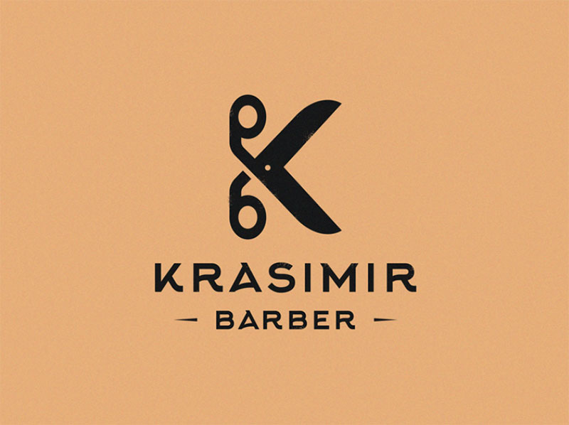
Image source: Yuri Kartashev
Barber Shop Logo
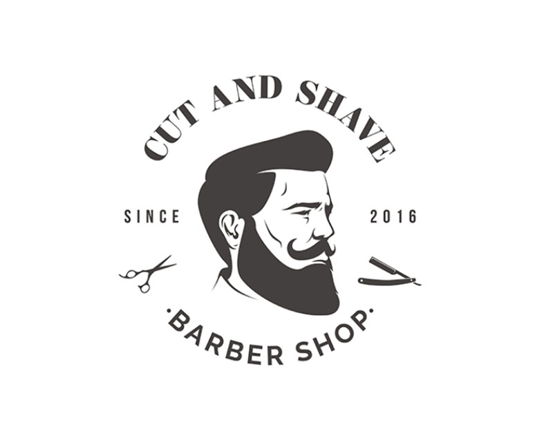
Image source: Noah Langworthy
Borough Barber
Image source: Gregory Grigoriou
barber shop
Image source: Yuri Kartashev
Barber Buds
Image source: Linus Kindstrand
Hell's Barber Logo
Image source: Michal Petergáč (.eu)
OBOB Barbershop
Image source: maDNA Design
Barber Shop
Image source: Maxim Temchenko
Barber Logo
Image source: Avoss
Barber Shop Logo
Image source: Sandi Caranovic
Woodman (barber shop)
Image source: Yuri Kartashev
Barbershop Logo Design
Image source: Tutul Hossain
Chopshop
Image source: Michael Browning
Macho
Image source: Yuri Kartashev
Vienna Barber Shop
Image source: Alexandra Necula
Barber Shop
Image source: matthieumartigny
Hillside Barber Shop
Image source: Defaced
Rocketman Logo
Image source: Leo
Knife&Pole
Image source: Max Iskra
Barbershop "Borodach"
Image source: Logo machine
Barkbershop
Image source: Gregory Grigoriou
Barbershop logo
Image source: Sara Dam
TB Barbershop
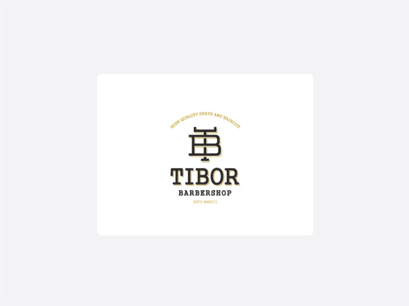
Image source: Mario Milojevic
The Sharp Razor
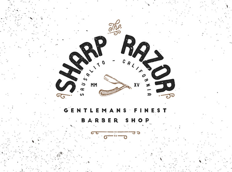
Image source: Federico Vaccarezza
Razor King Logo
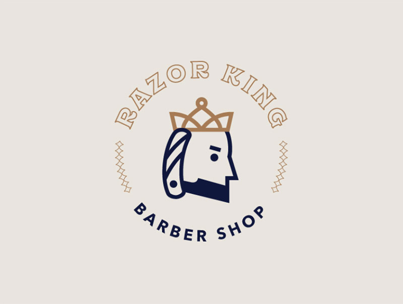
Image source: Kim Hanson
Hairacle
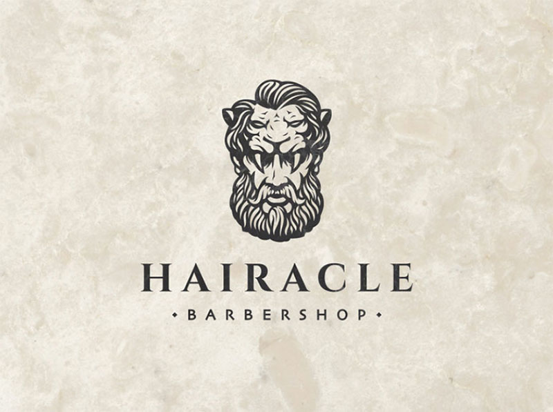
Image source: TalgatNurdinov
Abalvi Barber Shop
Image source: Mooral
Old Train
Image source: Yuri Kartashev
The Flying Barber Shop
Image source: jumjum
Lighthouse / barber shop
Image source: Yuri Kartashev
When a Barbershop Logo Idea Does Not Work
Most barbershop logo failures show up only after the design leaves the screen and hits a real surface.
Where a logo idea typically breaks down:
- A detailed vintage badge collapses into a blur once it's shrunk to a 48x48 pixel favicon or a small embroidered patch
- A generic barber pole and razor combination, copied straight from stock clip art, invites a distinctiveness challenge instead of building brand recognition
- A palette that depends on gradients or five-plus colors fails the moment it hits a single-color stamp, an engraved sign, or a one-color screen print
- An illustrated mascot leaning on a specific meme or trend dates itself within a couple of years, while a plain emblem or wordmark keeps working
Embroidery is where the small-detail problem shows up fastest. Industry guidance puts the minimum readable text height at around 0.25 inches (6.4mm), and anything smaller merges into an unreadable blob once it's stitched (Rush Order Tees).
A logo that only works in one specific size or medium isn't finished. Test it at favicon size, on a one-color stamp, and on a hat before calling the design final.
None of this means a shop has to default to the safest, most generic minimalist mark either. A distinctive icon simplified enough to survive small-scale use still beats a bland one that was never memorable to begin with.
FAQ on Barbershop Logo Ideas
Why do barbershop logos traditionally use red, white, and blue?
European barbershops typically use only red and white. The blue stripe is an American addition, and historians are split between a patriotic nod to the flag and a nod to the veins cut during bloodletting.
Is a mascot logo better than an emblem logo for a barbershop?
Neither wins outright. A mascot builds stronger recall for a single, personality-driven shop, while an emblem reproduces consistently across multiple locations, without new artwork for every character pose, which matters once a shop opens a second or third location.
What file format should a finished barbershop logo be delivered in?
Insist on the vector master file (AI, EPS, or SVG), not just a flattened JPG. From that master, a designer can export PNG files for the web and high-resolution files for print or embroidery digitizing.
Can a barbershop logo be trademarked if it uses a barber pole icon?
Yes, but the pole alone rarely clears registration. The USPTO treats a plain red, white, and blue pole as a common trade symbol, so the mark needs a unique shape, custom lettering, or an added icon to register.
What Should You Lock In First With Barbershop Logos?
Barbershop logo ideas come together in a fixed order: the trade symbol and overall style get decided first, the color palette and typography come second, and the production method gets chosen last, once the concept is settled.
- Trade symbol and overall style
- Color palette and typography
- Production method: DIY, freelance, contest, or agency
Reversing that order costs more than time. Ordering signage or apparel before the icon and style are locked usually means repainting a sign or re-cutting vinyl once the concept changes, since a multi-color badge costs more to reproduce than a single-color wordmark.
A shop that treats the logo as the first piece of a larger identity, not a standalone task, moves faster overall. The next practical step is mapping out everything else opening a shop requires, covered in how to start a barbershop.