Business cards are the first impression of the business world. Personal training business cards are no exception.
To design your own business cards, it’s necessary to do two things.
First, see what others in the field are doing. This will provide inspiration and show how to stand out.
Second, learn how to go about making your designs a reality. This article will help to accomplish both.
Personal trainers must advertise themselves well. Without clients, it won’t matter how good a trainer they are.
Business cards are attention-grabbing and cost-effective. They're an easy way to share all the important information future clients will need.
Their importance is why this guide exists. Here are an array of the best personal trainer business cards for you to learn from.
See how these trainers create more business with eye-catching, professional styles. Then leverage that knowledge to make your own.
Why Business Cards?
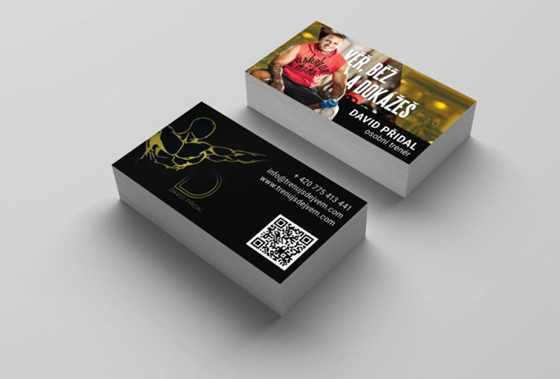
Image source: Daniel Buchl
Since there are many other proven marketing methods, why use business cards? Are they still an effective tool in our increasingly digital economy?
The reason business cards are so useful comes down to numbers. The more one markets and makes a business visible, the more sales there are.
By themselves, business cards are not enough. However, when used as part of an effective marketing strategy they can fill in any gaps.
They are a quick, easy, and cheap tool to get your personal fitness business' name known.
How To Create Personal Trainer Business Cards
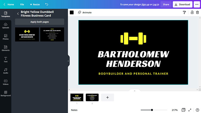
The first step is choosing a way to design the business cards.
Some skilled graphic designers have the programs necessary to make their cards. Thankfully, for those who don’t, many websites offer free business card templates.
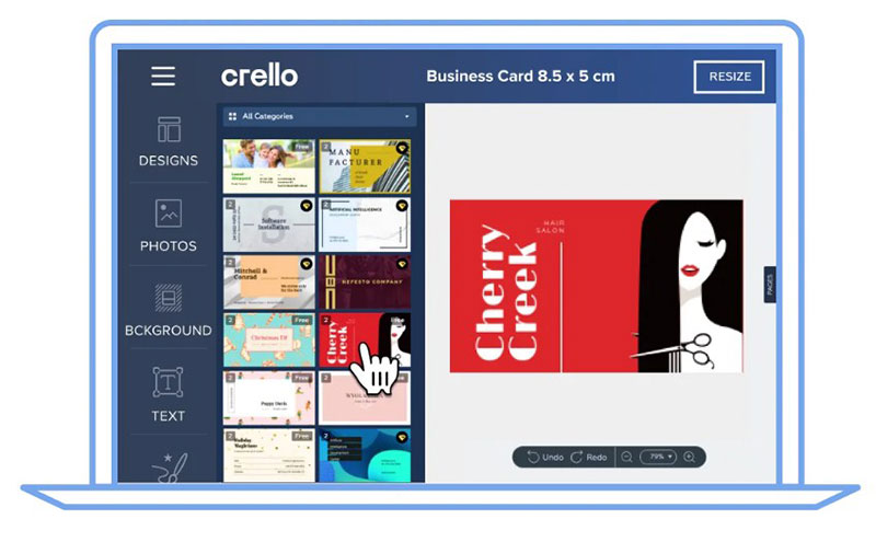
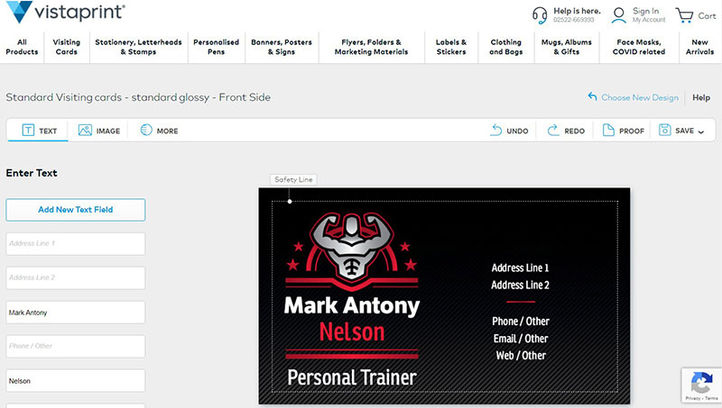
Those same websites for print design will print and ship the finished product to you. Some reliable options include Canva, Crello, MOO, and Vistaprint.
Canva and Crello are ideal for anyone without graphic design experience. They have a library of hundreds of professional and modern designs.
These collections are expanding to stay up-to-date with the latest trends and styles. Best of all, their websites are user-friendly and intuitive.
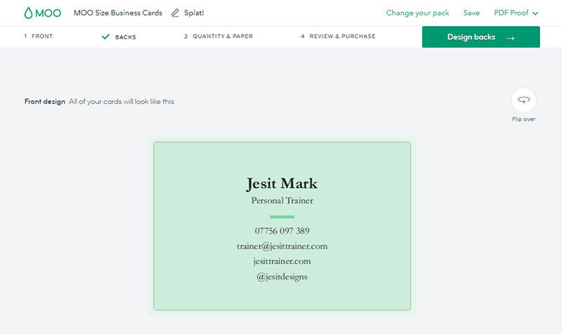
MOO offers the most customization. Users can design their digital business card from the ground up to include a name, address, phone number, website, photo, location, user bio, social media links, and much more.
Everything from logos to the tiniest details is editable.
Knowing where to build a business card is important, but it’s only half the battle.
12 Tips To Perfect Your Business Card Design
1. Include The Right Components
The key details on a business card are:
- Header & Slogan
- Image & Graphics
- Font & Text
- Colors
How much contact information to include varies. Personal trainers must know their market well.
Typical business cards include a phone number, address, website, and valid email address.
Social media accounts are also increasingly vital pieces of information. More and more customers are connecting to businesses via services like Facebook and Instagram.
The key is not to overwhelm the design with excess information.
Above all else, ensure that the business card is not cluttered. Keep things concise and well-aligned.
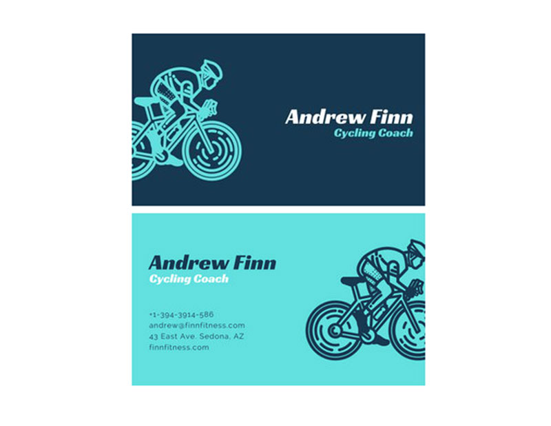
Here's a great example of a business card design that has the right balance of information:
Cycling Coach Business Card
2. Keep It Simple
A business card should not confuse the reader.
Most customers aren’t impressed by jargon, complex language, or obscure references. A business card must be comprehensible to be effective.
The most successful personal trainer business cards have clean, bold designs.
The best cards balance their design elements well. They know exactly what should and shouldn't be on a personal business card.
Simple does not mean boring. Utilize color and visual elements well to create a noteworthy and memorable design.
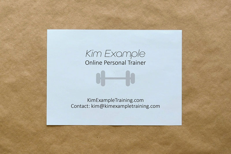
Here are two simple designs for the personal fitness trainer industry:
Black and White Business Card Front and Back

Clean White Business Card
3. Perfect The Header & Slogan
One of the most visible parts of any business card is the slogan or header. This one eye-catching piece of text can make or break a potential customer.
One simple way to make an effective header is to ask a question. "What is your fitness goal?" will appeal to the target market. Naturally, they'll begin thinking about how to achieve those goals - you.
Use different styles and colors to make sure the header gets noticed. It does no good if no one reads it.
It’s true that budget can limit creativity. But there are many good options even for cost-conscious businesses.
Think of a personal trainer business card as a physical website. It must immediately tell the world what the business is.
The best taglines are direct, like:
- Weight-loss Specialist
- Strength Training For College Athletes
- Injury Prevention For Seniors
- Look Better Naked In 1 Month
Some good examples are:
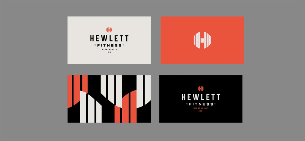
Black-Orange Business Card Front and Back

Business Card With a Clear Message

4: Include an Image
The expression "A picture is worth a thousand words" also applies to business cards. An image can convey ideas better and faster than any words.
When personal trainers design their business cards they should select the right image. One option is to arrange a professional photography session to get the perfect photo.
The image is important, but so is the way it's used. Make sure it's positioned well on the card.
Bad print quality will detract from the photo and make a bad first impression. So make sure the cards are sharp and clear by having them printed professionally.
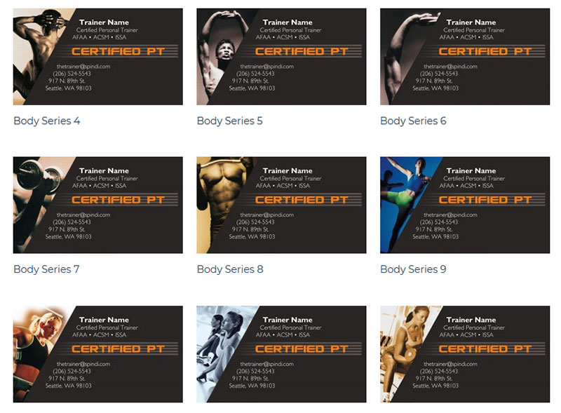
Here are examples of photos used well:
Photo Of Business Owner On Card

Red-Black Graphics With Photo
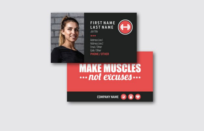
Assortment of Fitness Photos Used In Business Cards
5. Carefully Consider The Text
A good personal trainer business card will have effective text. An important factor to remember is the presentation and organization of the text.
As much thought should go into the font and text layout as the logo.
To send a clear message to potential clients a card must be clean and clutter-free. Bold and elegant fonts are popular now because of how well they achieve this.
Whatever the choice of font, make sure the typography matches your brand.
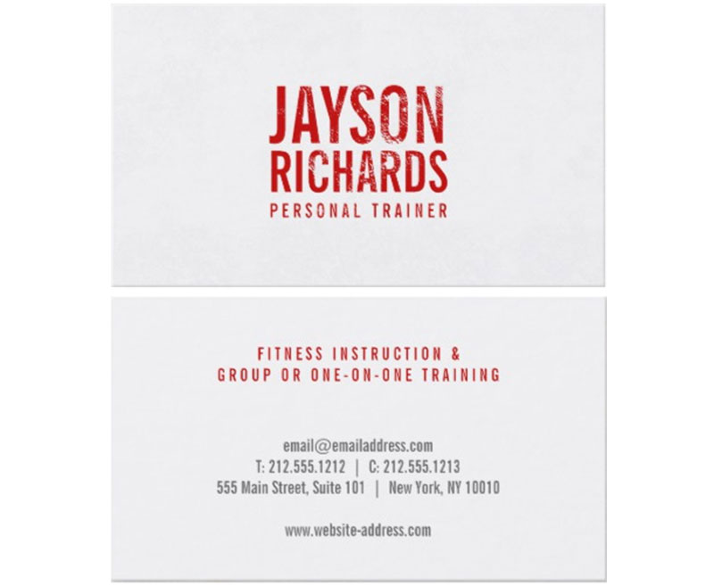
Here are good examples to learn from about how to best organize fonts and text:
Sports Massage Business Card Front and Back

Clean Cut and Bold Text Layout
6. Make The Colors Count
In nature, colors signal specific things and can stimulate an individual to act. That same instinct can benefit your business.
An excellent marketing strategy is to use colors to influence behavior. The colors on a business card can link your services with certain qualities or emotions.
A quick Google search for 'fitness brands' will show us many different logos. Typically they are either blue, black, grey, orange, or red.
It's no surprise that there is such a high usage of blue. People often associate blue with goals, determination, and control.
Here's a prime example of using blue effectively:
Electric Blue Business Card Design

7. Make The Title Compelling
The best titles are short and direct. They'll motivate the reader with large, bold, easily-seen fonts.
The text itself can be your name or a keyword that identifies the brand. Use the title to tell clients what to expect from you as a personal trainer.
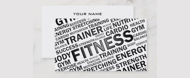
Like this example:
Business Card With an Impactful Title
8. Add Texture
Business cards are often held or carried.
More than other forms of advertising, the texture matters here. It can leave a powerful, lasting impression.
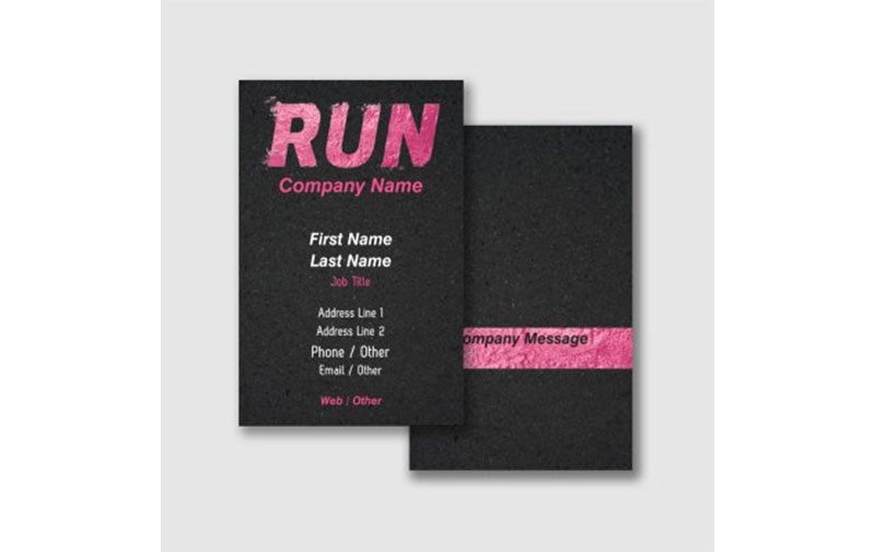
One good example is this:
Business Card With Textured Font
9. Appeal To The Demographic
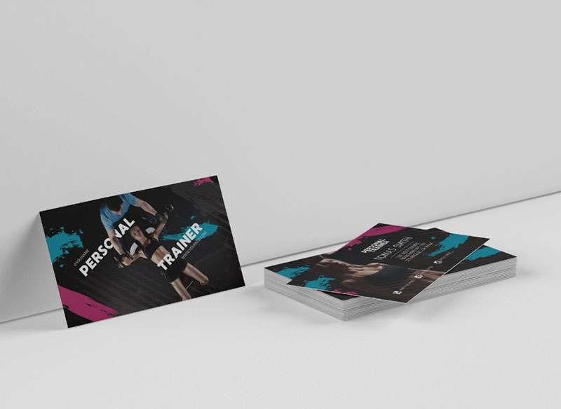
Know the audience and use that knowledge in the card designs. Whatever the demographic is, target them specifically.
A trainer could be conducting a women's self-defense workshop or kids parkour training. The methods for advertising to each should be very different.
It’s possible you have a diverse demographic and offer a variety of services. Consider using different business card designs to market to different demographics.
Get more bookings with the right tool for the job
Staying organized has never been easier.
You can now manage your business and grow your brand with a single, powerful software that keeps all of your appointments in line, your clients organized and your business booming.
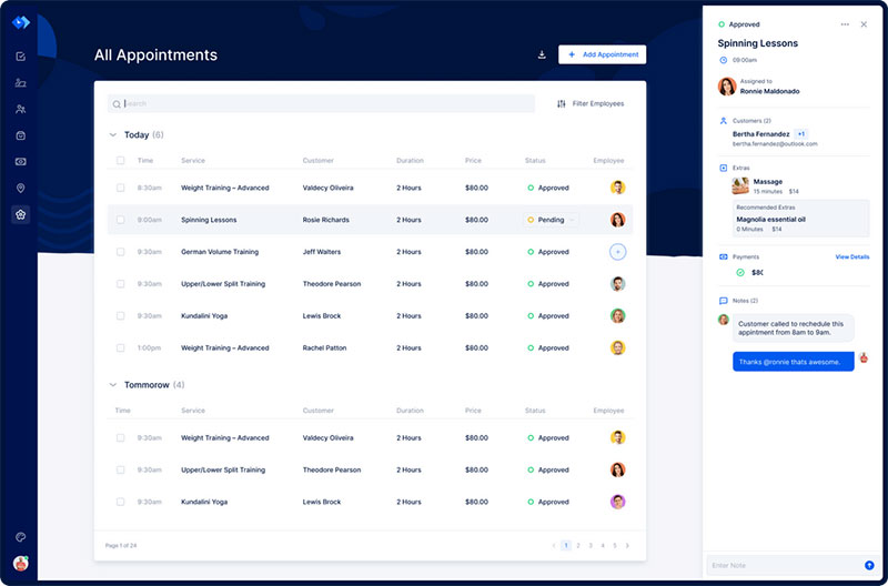
Trafft is the perfect personal trainer software for business owners who need to streamline their booking experience both for their staff and their clients.
Trafft handles everything for you, even sending automated email or SMS reminders to your clients. No-shows? Not anymore!
The Trafft booking software adapts to different industries for a blissful online booking experience and employee management.
Want to know more? Check out Trafft's awesome features to see what you are missing.
10. Use The Logo As The Centerpiece
Your business card is the perfect place to showcase an eye-catching logo. Trainers who have one should make it the star.
Logos are memorable and convey details about the brand. Put the logo front and center on the business card.
All media related to a business should be consistent. The logo, color scheme, and fonts should be the same.
Your business should be recognizable no matter what form of advertising is used.
The business card and website should go hand and hand. This will make things clear and professional.
Once you have a layout, stick to it.
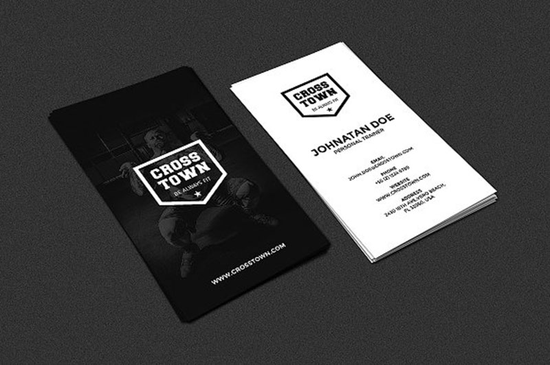
This example shows how to use a logo as the anchor of an entire business card:
Well Placed Logo On A Business Card
11. Make Your Name Work For You
If your name is memorable it can be an asset to the business. It could be worthwhile to use it as the focus of your business card.
Make sure the other elements don't detract from your name. Your name could be synonymous with the business, like a logo.
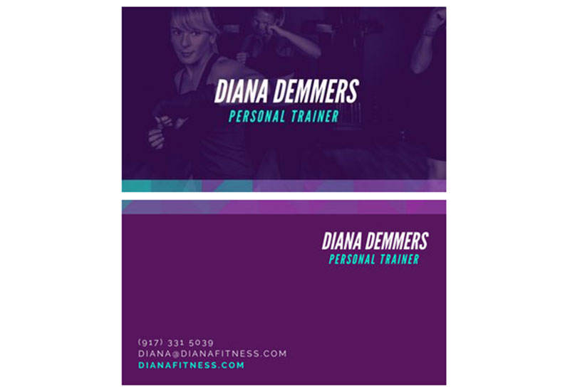
Use a design that focuses on your name. A blended background image with your name in one sharp color works well.
As with this example:
Name-Focused Business Card
12. Be Creative
Don't stay within the confines of the traditional business card.
Try changing the shape and size of the card. This sets you apart from the crowd.
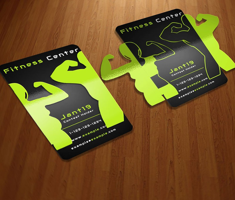
Even small changes make a big impact when everyone else is using rectangles. Consider rounding the corners or cutting out patterns.
Try out different orientations. If a business card stands out, so will the business.
Takes some inspiration from these two creative cards:
Foldable Flaps Card
Business Card Etiquette
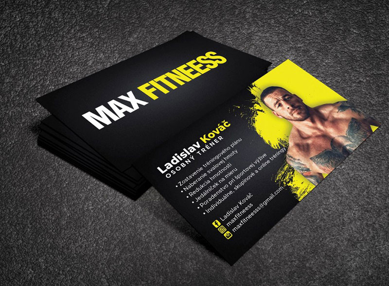
Image source: kawser Mazumder Anik
A professional treats and uses business cards a certain way to make the best impression.
- Always make sure business cards are on hand and in mint condition.
Don't use any bent, torn, or dirty cards. You should be able to produce a perfect card within seconds of a client asking.
- Hand the card over with the text facing the receiver.
Don't cover any details. Keep all of the card clearly visible.
- Look the receiver in the eyes and offer a warm smile.
- If the receiver is likely to have a card of their own, ask for it.
FAQs about personal trainer business cards
1. What information should I include on my personal trainer business card?
Your name, work title, contact information (phone, email, and website, if you have one), and any pertinent certificates or credentials should all be listed on your personal trainer business card. A tagline or slogan that expresses your special value proposition as a personal trainer might also be included.
2. What is the ideal size and shape for a personal trainer business card?
The typical business card size is 3.5 by 2 inches, making it easy to carry in a wallet or cardholder. The most typical design is a normal rectangular one, but you can also experiment with rounded corners or die-cut shapes that are representative of your company.
3. What type of paper or cardstock should I use for my personal trainer business cards?
Choose a cardstock that will withstand wear and tear and be durable. Seek for cardstock with a matte or glossy texture that is at least 16 pt thick. Avoid using paper or cardstock that is too thin and is likely to crease or tear.
4. Should I include a photo of myself on my personal trainer business card?
Whether you put a picture of yourself on your personal trainer business card is entirely up to you. A photo can make you more recognizable to customers and help you build a personal connection, but it can also take up important card space. If you do include a picture, make sure it is clear and well-done.
5. Can I use pre-made templates for my personal trainer business cards, or should I create my own design?
There are numerous pre-made templates for business cards, including those designed with personal trainers in mind. Yet, making your own design might help you stand out from the crowd and display your unique brand. If you do decide to use a pre-made design, be sure to include your own details and branding components.
6. How many business cards should I order to start with, and how often should I reorder them?
Depending on how regularly you distribute them, make sure to order enough business cards to last you at least a few months. If you run out, you can always order more later. Depending on how frequently you change your information or brand, aim to order new business cards every six months to a year.
7. Are there any design elements or graphics that I should avoid using on my personal trainer business card?
Avoid employing graphics that are unrelated to your brand or business, difficult-to-read fonts, or too complex designs. Maintain a straightforward, clean style that shows your important details and makes it simple for customers to get in touch with you.
8. Should I list my social media handles on my personal trainer business card, and if so, which ones?
Your social media handles can make it easier for clients to connect with you across platforms and keep up with your services by being listed on your business card. Concentrate on the social media sites, such as Instagram or Facebook, where you are most active and where your target audience is most likely to be.
9. Is it important to have a tagline or slogan on my personal trainer business card?
A tagline or phrase can help you stand out from the competition and explain your special value proposition as a personal trainer. It should convey what makes you special as a trainer and be succinct and memorable.
10. How can I make my personal trainer business card stand out and be memorable?
To make your personal trainer business card stand out, focus on a clean, modern design that shows your logo and vital information. To make your card stand out, think about utilizing vivid colors, intriguing fonts, or unusual textures. Also, you may try to include a special saying or proverb that encapsulates your company's core principles.
Ending thoughts on personal trainer business cards
Everyone wants their business card to represent them and their business well. By designing memorable cards, personal trainers can attract potential clients and make more money.
The 12 tips outlined in this article will ensure your card is inspired and effective. Thus, trainers can stay ahead of the competition.
A business card is only one step to success. The person carrying the card also needs to advertise the business.
Be kind, engaging, and helpful when dealing with customers. Professionalism will make the card stand out just as much as its design.
Be the sort of personal trainer people want to contact. Then use a business card to make that contact easy.
Business cards won't do all the work alone, so don't hand them out expecting miracles. Potential clients don’t choose their trainers based on how cool the business card is.
They want a personal trainer who can make their goals a reality. Be that trainer and then use business cards to introduce yourself.

